Cinema Lighting for Beauty Photography
At first glance, this picture seems both straightforward and complicated. Makeup is the key here—it’s all about cosmetics (the lighting only highlights this).

Photographer: Neil Snape
In order to make a dramatic image like this, especially one that looks decent on paper printed on a rotary (helio) press, a hint of hard light keeps the contrast believable and adds a bit of dimension.
During my time at Publicis—the agency that does most of the beauty and cosmetics advertising in Paris—the chief art buyer told me that you need to make your pictures appear as if they’ve been shot in daylight rather than a dark studio.
Every time I shoot, I remind myself of this, and since then I’ve shot more with daylight than studio clinical flash. Furthermore, clients sincerely appreciate photographers who can shoot both stills and video. This is also something I will work on, hence the raison d’être for this picture.
Camera
First, the details: I captured this image using a handheld, but I shouldn’t have done that. Why? Even when shooting with flash, there is always some motion blur. Also, learning to shoot video insists on more rigor, and a fluid head is the key to making smooth video, short of using a steady cam.
It was shot on a Canon 5DMKII, ISO 200, wide open at f2.8 on a 100mm Macro non IS.
Distance from camera to subject was about 1.5 m (approximately 5 feet). Now, handheld is already hard enough, but I also had to wave the aqua azure filter (Rosco sample filter pack) in front of the lens to try to find a reflection of the window behind me. The filter was close to the lens, but not so close that it obstructed the window reflection behind.
The girl was propped up on her elbows, with one hand resting against her cheek, so it was fairly easy for her to maintain this comfortable pose. She did have some trouble with the lights in her eyes, which made it difficult for me to get pictures of her without her squinting.
Lights
This is a case where the main light is not necessarily the brightest light. It is a mix of lights, and contrary to best practices, there is no true main light priority.
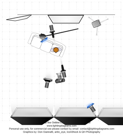
The best directional light is a spot Fresnel— a 150 W modeling light that has an 80B blue correction filter with a 2X neutral density. The Fresnel was open to allow a large circle of area, so the model could move without drastic light changes. For still photography sometimes the light can be more precise, but that requires models that don’t move about. It is about 0.5m slightly to the right of camera and just above the horizon as seen in the nose shadow.
There is also a light to the right of the model, higher and outside the windows 80B filter. I used it to add additional ambience to the background, and I turned it to add just a hint of shading to the face.
To the left of the camera is a P65 (large bowl reflector), filtered 80B and four leaf barn doors. The doors are closed in a lot to restrict the light to the face more than the arm.
Behind the camera is a huge window that faces southwest. There were overcast skies that day. That is what makes her eyes so clear and the fill light creating very gentle wrap around light.
Behind the couch are two lights, and two reflectors or mirrors.
The first is one for effect and drama, a snoot on a Pulso head with an 80B filter. Normally, I’d remove the handle on the flash using Photoshop, but I left it in for now. That’s what’s adding a bit of flare, and I shot without a lens shade on purpose to allow the flare in the pictures.
The second light is a Pulso head on a boom (you can see the boom stand) but not filtered. It is in fact this light that is making most of the flare, and the rim lighting.
All modeling lights were at full power, yet the filter reduces the light by two stops. Ambient light was just under the continuous light f2.8 ISO 200 1/125th s).
There is a mirror to the left and behind and a metallic fabric on a polystyrene board to the right, which provides ambience. We tried to find the right angle for the board, and the right small folds to break up the large reflection.
Not much retouching needed, just a bit of tinkering in LightRoom.

Photographer: Neil Snape
Neil Snape
Neil Snape is a professional photographer based in Paris, France. He specializes in beauty imagery, and his work has been featured in numerous publications, including Marie Claire, Biba and Jalouse. He also does commercial work for L’Oreal, Cartier, Lanvin Paris, LVMH and Sonia Rykiel. His website is www.neilsnape.com
Follow Me:


July 12, 2015 at 6:13 pm, Kent Johnson said:
great as always.
July 10, 2015 at 7:02 pm, Tran Fost said:
I am starting to hate those ‘tutorials’. It would help a little if the images were beautiful and of good taste. Just looking at the attached images assure me that whatever ‘knowledge’ is being shared in the article is something I don’t need to know.
July 11, 2015 at 11:46 am, Silverstream said:
Obviously your taste/style is different than what many other people find appealing/interesting. Being able to create this look in camera is quite challenging beyond most photographers skill level in my opinion and truly is a work of art. Would I have done it differently? Yes because I always put my own spin into my work. Does that mean that just because my taste or style is different that I can’t respect what others create, heck no. And frankly the point here is teaching a complex lighting technique, not about whether you like their style or not.
July 11, 2015 at 10:11 pm, Tran Fost said:
I must say that I did expect this kind of reply, and knew that this is what I will get, so I won’t complain 🙂
The effects created here are ugly and plain bad taste in my opinion. And even the choice of model and look is terrible. Of course we can argue what is ‘bad taste’, or ‘beautiful’ for years and never agree. But that would be rhetoric and arguing for the sake of arguing.
Again you will disagree etc etc… but I would say let our work do the talking. I no longer use MM anyway, except for the newsletter I still receive, and that is mostly due to the bad taste and lack of quality of most of the work there. MM is a phase, then you are supposed to grow and get better and no longer want to look at these horrible images.
🙂
Best,
July 12, 2015 at 8:16 am, Silverstream said:
Interestingly, I also rarely use MM these days and it is pretty much limited to these newsletters. I also as you say “went through this phase” with MM and it exposed me to so much particularly as an amateur. There are still things though that we can learn everywhere. These days I am happy if I read an article and watch a photography video and learn one helpful thing. Do I like everything that is done? No. Do I bother critiquing their lighting style and model? No. I am simply thankful that some people make the unpaid effort to share their knowledge.
July 12, 2015 at 7:01 pm, Tran Fost said:
I understand you totally.. I’m simply frustrated and seeking more ‘beauty’ surrounding me, and like-minded fellow photographers whose aesthetics keep me inspired. That’s all.
Best,
July 09, 2015 at 6:24 am, Sharon Robinson-Clayton said:
Hi Neil, excellent picture, excellent work!!! Kudos to the makeup artist! I have a question that I hope is not offensive to your talent. I am not a photographer, but is there any suggestion/tip that you could give to achieve even the slightest similar picture quality outcome using a iPhone camera? I am an Mua and I am always trying to position lighting and the model to get a flattering picture.
July 08, 2015 at 7:33 pm, marko said:
I guess some find the blue tint artistic, I find it destructing. Also, this is massively Photo-shopped. Anyway, if you achieved what you wanted good for you. Many times I do not achieve what I envisioned so that’s by itself a good thing.
July 25, 2015 at 9:47 am, Ruud van Gaal said:
According to the author (Neil), it’s not Photoshopped, only slightly enhanced in Lightroom. I’m not really interested in whether I like the photograph, but more in recognizing what is being done in the photograph, and picking those points that are described that I find interesting. It’s mostly comparing what others do to what I do or could do. In that light, I find the article interesting, although there are quite a few lights. Still cool to achieve a picture that doesn’t look like it was lit using a zillion lights though. 🙂
July 08, 2015 at 3:33 pm, Silverstream said:
Very nice and beautiful MUAH work too!
October 17, 2012 at 9:11 am, Natasha said:
I was looking for some inspirational articles and fell upon this one. I am floored that you took the time to do this and will definitely be working on this style this weekend. Not sure if I will try 5 lights but it is style I can see enhancing my work.
Thanks again and keep it up!
Natasha
October 17, 2012 at 4:49 am, Kevin Berry said:
Hey Neil, amazing image, really inspiring stuff, on a side note, are you able to do examples with 2 or a max of 3 lights? I can only speak for myself here but I only own 2 lights at present and the Studios I use have 3 lights. I want to improve my work but see tutorials with 5+ lights is out of my league at the moment.
August 15, 2012 at 10:12 am, hairlficksmodels said:
I think what people see as “softboxes” is the large windowlight that IS mentioned. Lovely shot complicated lighting for what -as some people have mentioned-is unnecasary.
August 14, 2012 at 12:06 pm, Jake Hicks said:
Thank you for taking the time to write this article neil. Always great to see how other photographers achieve their shots.
No thanks goes to all the camera monkeys who critise the technique, I think you would need to be pretty damn good at photography to put this guy down. 30 seconds on his website would tell you he knows what he’s talking about, whether you agree with him or not.
August 14, 2012 at 10:51 am, TeevonTee said:
As someone who has spent the majority of time shooting landscapes, it’s great to gain the benefit of your experience around something so potentially counterintuitive as setting up lighting for studio work. Thanks for sharing!
June 22, 2012 at 2:43 pm, Rich Fehrman said:
Hey Neil thanks for taking the time to explain one example of how you light your subject. It’s interesting to see how the “real pros” go about setting up their lighting and executing the photo shoot.
What gets me are the comments like “you could have shot it with 2 lights” but yet the guy couldn’t figure out that the softboxes in your diagram represented soft window lighting, even though you mentioned if in your article. Or how about the “flare being massively distracting” even though you as the artist placed that there from your vision of what you wanted to achieve. Oh, and how about “she looks like a vampire”, not caring less if that paleness is what you as the artist wanted.
Now, I don’t know how good these guys are, but I can almost guarantee you that by the comments, these guys are no where close to your level. I come to realize that the know-it-alls probably shouldn’t call themselves photographers because no one else does.
Sorry to vent but I just feel that when someone who is a successful pro photographer takes the time to help out those with less knowledge or talent, they should practice a little self control and not post their ignorant and stupid comments, because they don’t have anyone fooled but themselves
Again, thanks for taking the time to educate us less talented photographers
Huge fan
Rich Fehrman
MM #370954
June 26, 2012 at 6:40 pm, miamifashiophoto2 said:
Yea… I guess my personal knowledge of having been judged and having judged myself international print competitions, I notice things like overly distracting blue dots near the persons face that does nothing to improve or bring interest to the image and distracts from the main subject. Or for instance or amputated left arm. Or how yes… you can do it with two lights. If you want to represent those other lights as a wall of windows then do so. The same app I have that makes these diagrams has large windows. But taking that way you still have 5 lights in this setup.
Not to mention… when people make posts like this talking about lighting setups and tips, they should really have a bit of professionalism and instead post their image (or at least side by side) the image OUT OF CAMERA, and not the massively photoshopped version that we see here above.
But hey… just my opinion.
March 02, 2016 at 8:29 pm, nudetim said:
Rich, I do tend to agree with Miami Fashion on many respects,
My experience with photography has shown that you want to concentrate the eye on the subject at hand, and in this case the model’s face and make up! Which the capture of her eyes, lips and such are in sharp focus!
There are some distracting elements in the photos that are drawing my eye away from her that tend to bother me!
The flares are too much and are a way of covering up other areas that are obviously not up to my standards, like amputating left hand, in both photos, and while not hidden by a flare, it is a glaring thing to see in the shot that part of the right hand is missing in one of them! While an amateur might not notice this, someone with photographic training and professional ability would say that is not up to my standards. Additionally, the flare in the first one makes her bicep look larger than it should be.
I also notice distracting objects in the image that also draw the eye away from the model. In the first image is the bright spot protruding from the side of her head, which is a snoot pointed toward the back of her head! There is also a light stand that I find too dark and if it were to be in the image, it should not so prominent, it should be a hint, not a bold statement.
I also agree with Miami Fashion on the number of lights. While Fashion and Makeup photography pretty much dictates that the model should be fully lit, 9 strobes seems excessive, when the same thing can be done with just 2 or 3 strobes with some well places reflectors!
A friend of mine who is locally known for such images, uses just three, with softboxes to even out the light, and a single reflector to get the job done. His ideas are less is more and to keep it simple is what sells the photo.
When you add to much, it over does the effect! Never ever add distracting elements to draw the eye away from the subject!
March 02, 2016 at 9:04 pm, alberto cabrera said:
Sorry found this funny. I just got a notice from MM about this article. I have my own opinion. But reading your comment made me laugh. Never assume that a poster is a nobody. Just doing that is ignorant and stupid.
A lot of talented artists are brilliant at what they do. Thou that does not make them brilliant teachers. Miami’s observations are valid and questioning Neil’s method only proves that he was processing what Neil shared.
June 22, 2012 at 10:55 am, miamifashionphoto said:
Should be captioned…. “how to make a photo using 10 lights when you only really need two”. I am guessing the three softboxes shown in the diagram up front aren’t actually being used here as they weren’t in the description? Not sure why they are in the diagram then. This shot can easily be done with 2 lights, 3 lights tops. 2 lights especially since I wouldn’t bother personally with the blue lens flair light because it is actually massively distracting to the image.
June 23, 2012 at 10:49 pm, cjs711 said:
Not sure about two lights……. but I think taking a second look at what the blue flare is doing is valid. Take a good look at what it is doing to her left arm. Wtf? Love what your lighting is doing for her eyes and I’m fine with the white skin. But not all our complicated ideas are necessarily good a.d I think the blue flare needs more adjustment to make a beneficial Co tribution.
August 16, 2012 at 2:32 pm, Kelli Kickham said:
Hmm.. Ok, post a similar shot you’ve taken with two lights and we can compare.
June 21, 2012 at 10:34 pm, KG said:
Hey Neil,
Great image. I am not sure what work the Fresnel is doing. It appears the barndoor light is the one illuminating her face. Is the Fresnel just filling the shadow and illuminating her body while the barndoors bring up the facial tones and create the form?
June 22, 2012 at 9:15 pm, Neil said:
No the Fresnel is the main light , although it can be hard to judge from the 2D lighting diagram where exactly the light is. It would be better to take an actual picture of the set up, easier to read the position. The P65 is fill for her right side as the Frensel is a sharp concentrated light that would have too much contrast for this type of lightness. OR you could light it with 1 light the whole picture to be better at it than miamifashionphoto . That is someone who really knows what they are doing!!!!
June 23, 2012 at 10:26 am, KG said:
OK, thanks. I was just looking at the direction of the nose shadow and didn’t see how the Fresnel could cast that based on its position in the drawing and description,
June 21, 2012 at 5:00 pm, Arznix said:
Great article and very clearly explained.
I always wondered how you were able to achieve the different blend of colors in some of your photos without more color bleed from the gelled strobes/lights. Holding the gels up to the camera lens as opposed to the gelling the lights is a neat trick that should be obvious, but frankly never occurred to me.
Thanks for sharing your depth of experience.
Hopefully you are enjoying your brief visit back in Canada and are getting the reaction you need to make the move back.
I would love to see an article on the recent nudes that you shot. Were the light patterns refraction through glass objects or light painting?
June 21, 2012 at 7:57 am, Marcus Marshall said:
I don’t know if it’s the lighting, post-processing or the makeup, but that isn’t a good example for this tutorial. She looks like a vampire. Way too pale, especially in the face. Cinematic lighting is much warmer and even in skin tones. Especially in the face. I do like the way her eyes pop though.
June 21, 2012 at 9:53 am, Neil said:
Marcus, you may never have heard of color grading. Nor are you aware of types of light other than tungsten. HMI can be many start white balance, most of which are 5500 K- 6500 K. Filtered halogens 3200 K can be whatever you like as is the case here. There is no real post as the image posted for the tutorial is not retouched, directly out of the camera with control sets in LR for color grading and lighting. Now if you don’t like the image, that is your opinion, and your choice.
July 08, 2015 at 1:08 pm, Jim Jones said:
Great image, and thanks for taking the time to explain the details of how you took it.
June 21, 2012 at 7:19 am, Tomek Henke said:
Fantastic work Neil and very inspiring post. Sorry to be so direct but it would be great to assist you at some projects.
June 20, 2012 at 4:52 pm, Thomas McInnis said:
This is a fantastic article – you’ve inspired me to try some new stuff for sure! Thanks Neil!!!
June 20, 2012 at 1:00 pm, Scott said:
Neil,
Very nice article. Can you clarify – is this 100% continuous light (including daylight), no strobe/flash?
June 20, 2012 at 8:23 pm, Neil said:
No flash, only the modeling lights filtered for color correction