This thread was locked on 2024-05-17 07:01:12
Photographer
JSouthworth
Posts: 1830
Kingston upon Hull, England, United Kingdom
Here is a link to an e-book version of a book I am still working on; https://www.bonusprint.co.uk/view-onlin … 22915addbf Your comments and suggestions are welcome. The final version will have some re-editing and changes to the layout but will be basically the same book. The title is a reference to the fact that all of the images were produced using film.

Photographer
Frank Lewis Photography
Posts: 14494
Winter Park, Florida, US

Very interesting. I like your choice of models, they aren't your average runway model. That in itself makes the images in the book interesting. The motorcycle is a Honda Rebel? Good choice. We see too many Harley's in this kind of shoot. Well done. I look forward to seeing the finished book.
Photographer
JSouthworth
Posts: 1830
Kingston upon Hull, England, United Kingdom
Frank Lewis Photography wrote:
Very interesting. I like your choice of models, they aren't your average runway model. That in itself makes the images in the book interesting. The motorcycle is a Honda Rebel? Good choice. We see too many Harley's in this kind of shoot. Well done. I look forward to seeing the finished book. I couldn't afford the top professional fashion models even if I wanted to employ them, which I don't particularly, because their looks generally wouldn't suit my style of photography although I'm sure there are exceptions.
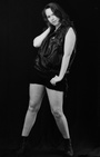
Some of the women I've photographed are nevertheless exceptional in their own way, Penny at left for example is 5ft 10in tall in bare feet and 12 1/2 st, a lot of which is muscle. I like large women who aren't overweight.
The motorbike is actually an Chinese made AJS Regal Raptor 250, the two cylinder engine is a Honda design so it does resemble a Honda 250. I prefer it's looks over most modern motorcycles. If the opportunity arises I may get another motorcycle for prop use. I like the look of some of the Yamaha V twins, the Virago series.
https://www.motorcyclenews.com/bike-rev … 250e/2003/

Photographer
Midnight Picnic
Posts: 20
Los Angeles, California, US
I commend you on putting together a book; it's not an easy process, and I think it's very important and fulfilling to create an actual physical product with photography.
Overall, I think you have too many images. We're seeing the same models over and over, in the same backgrounds and in very similar poses. A few times, I had to double-check to make sure it wasn't a duplicate image repeated different places in the book. Honestly, I think you could cut the number of images in half; avoid anything that feels even remotely repetitive, and that will strengthen the images you do showcase.
I also think that you are framing/cropping your images with too little headroom. In some cases, you're even cutting off the model's head, feet, or hands, in a way that feels less like an artistic decision and more just like careless framing. I've noted some specific examples below (along with other comments).
12-13 - Why, of these two similar images, is one bordered and vignetted, and the other isn’t?
14 - The photo in the top right feels out of place. I think the page would be better served with another image of the model on the couch.
26-27 - The crops on these two photos feel awkward and unmotivated (particularly on page 27). What’s the reason for losing her head and arm in both shots?
40-42 - Why the repetition of what feels like the same image?
52-53 - These are interesting, dynamic shots. Would have liked to see more of this type of shot in your work (but it’s very different from the others).
44top - 66 bottom - feels like repetitive to the same shot.
Photographer
JSouthworth
Posts: 1830
Kingston upon Hull, England, United Kingdom
Midnight Picnic wrote:
I commend you on putting together a book; it's not an easy process, and I think it's very important and fulfilling to create an actual physical product with photography.
Overall, I think you have too many images. We're seeing the same models over and over, in the same backgrounds and in very similar poses. A few times, I had to double-check to make sure it wasn't a duplicate image repeated different places in the book. Honestly, I think you could cut the number of images in half; avoid anything that feels even remotely repetitive, and that will strengthen the images you do showcase.
I also think that you are framing/cropping your images with too little headroom. In some cases, you're even cutting off the model's head, feet, or hands, in a way that feels less like an artistic decision and more just like careless framing. I've noted some specific examples below (along with other comments).
12-13 - Why, of these two similar images, is one bordered and vignetted, and the other isn’t?
14 - The photo in the top right feels out of place. I think the page would be better served with another image of the model on the couch.
26-27 - The crops on these two photos feel awkward and unmotivated (particularly on page 27). What’s the reason for losing her head and arm in both shots?
40-42 - Why the repetition of what feels like the same image?
52-53 - These are interesting, dynamic shots. Would have liked to see more of this type of shot in your work (but it’s very different from the others).
44top - 66 bottom - feels like repetitive to the same shot. I can assure you that there is no repetition of images in the book. But did you notice the similarity of the pictures on pages 100 and 101?
https://www.bonusprint.co.uk/view-onlin … 22915addbf
Page 14. That's just me having a bit of fun really. In the latest version I've adjusted the relative sizes of the pictures so that the edges line up.
26-27. On page 27 the model's left hand is out of frame, but not on 26. That's the case in the original image, that isn't ideal composition but Penny's legs and feet are really the point of that picture.
40-42. I really liked that pose by 6ft 4in Hannah Riby, it's just impressive. So I included a few variations in the book.
44 top- 66 bottom. Consecutive shots on the same roll of film. I thought they were both good pictures, so I used them both. By using similar pictures in different places in a book you can give it a kind of rhythm, a bit like reprise in an image or a period in music perhaps.
12 - 13. That's just the way they are. Or rather the way they were; I've now replaced both of these with re-edited versions with higher contrast.
The latest version has more (108) pages with more pictures and some further re-editing of images to make them print better. But unless you have a very large computer monitor the e-book will not have the visual impact of the printed book.

Photographer
NakeyPiX
Posts: 733
Las Vegas, Nevada, US
Midnight Picnic wrote:
Overall, I think you have too many images. We're seeing the same models over and over, in the same backgrounds and in very similar poses. A few times, I had to double-check to make sure it wasn't a duplicate image repeated different places in the book.... I was going to refrain from saying anything but I totally agree with Midnight Picnic. It's basically the same shots of 3 or 4 models over and over and over again. I was bored and had to force myself to view anything beyond the 8th page.
Just like a good portfolio, the viewer should WANT to see MORE and not get BORED by seeing the same f-ing thing over and over again. Rationalize it any way you want but it's a fact!
Now the harsher reality.
It seems you like to light and focus on the wrinkled bedsheet backgrounds better than the models. There are MANY examples but 12 & 13 is a couple of them. Get an iron and/or use shallow depth of field and aim the lights at the model.
eg: the background on page 5 has more lighting than the model. The brightest thing is the blown out chrome sissybar on the motorcycle, and part of the engine. The most light on the model is on her boots, knee, part of one cheek, and one of the boobs close to to the armpit. Her face and most of the body are in shadows.
Many of the models appear to have splotchy skin. The human eye doesn't always see it, but different types of lighting can bring it out. Skin sorftening filters either on the lights, camera, or software will do wonders.
Finally, the whole album seems very amateurish for the reasons stated above PLUS the lack of new or interesting subjects and themes. C'mon... motorcycles, swords, guns, winkled bedsheet backgrounds.... the only things that you forgot to include is caution tape and angel wings..
Sorry.
Photographer
JSouthworth
Posts: 1830
Kingston upon Hull, England, United Kingdom
NakeyPiX wrote:
I was going to refrain from saying anything but I totally agree with Midnight Picnic. It's basically the same shots of 3 or 4 models over and over and over again. I was bored and had to force myself to view anything beyond the 8th page. There are actually eleven different models, and their names are listed on page 16 so you must be visually impaired, bad at math or both.
https://www.bonusprint.co.uk/view-onlin … 22915addbf
Your other criticisms are rather trivial. So the brightest areas of the chrome sissy bar on page 5 are washed out, so what? That might be a slight technical imperfection but it doesn't seriously affect the picture. With chrome, washed out highlights are pretty much inevitable, unless you want to start messing around with anti-reflection sprays.
I should perhaps be honest and admit that chance played a role in that picture. I used three flash heads, two on the right (from the camera position) and one on the left, and the two on the right failed to fire on that frame. I like the resulting low key effect even though that image has proved a tricky one to edit.
The cloth backdrops I use are Indian cotton throws which I buy on ebay, you can get them in sizes up to 354 cm X 230 cm and they're available in a range of colors and patterns. Smooth paper backdrops are rather boring I think.
Photographer
NakeyPiX
Posts: 733
Las Vegas, Nevada, US
JSouthworth wrote:
There are actually eleven different models, and their names are listed on page 16 so you must be visually impaired, bad at math or both. I'm awefully sorry about not accurately counting the amount of models in your book. Maybe it's because not-so-subconciously I wanted to forget what I saw.
I thought I might have been mistaken and even considered going through the book again and counting them, but that really would have been MISERY for me to go through all those amateurish photos again.
Really, the first time it was PAINFUL after viewing just the first few pages
I didn't want to do it again.
JSouthworth wrote:
Your other criticisms are rather trivial. It's the little things that can make or break a photo, or any other product.
On the other thread you seem to be worrying about the difference between CMYK and printers with CMYK extensions because of your claimed 'high standards', but when there's a glaring problem (pun intended) you write it off as a trivial matter.
JSouthworth wrote:
So the brightest areas of the chrome sissy bar on page 5 are washed out, so what? [That might be a slight technical imperfection but it doesn't seriously affect the picture. ... JSouthworth wrote:
The cloth backdrops I use are Indian cotton throws which I buy on ebay, you can get them in sizes up to 354 cm X 230 cm and they're available in a range of colors and patterns. Smooth paper backdrops are rather boring I think. If you really were the lighting expert that you claim to be, or even if you've taken a 'Lighting 101' class you'd understand that the human brain directs the eye to the BRIGHTEST part of a scene, especially when the rest of the scene is darkened. I find it highly unlikely that your point was to make the sissy bar the center of attention.
If you've ever been to a theatrical production, or even just watched one on TV it's pretty obvious that spotlights are used to illuminate the main characters.
Judging by your lighting 'technique' and the rationalization that followed, I have a feeling if you were the director of those productions, you'd illuminate the theater curtains because they're made of Satin Lined Triple Pleated Royale Performance Velvet instead of the talent that the audience prefers to see, which would end up in everyone walking out and you being the laughing stock of the industry.
JSouthworth wrote:
With chrome, washed out highlights are pretty much inevitable, unless you want to start messing around with anti-reflection sprays. No, not at all. A photographer with the most basic concept of lighting can easily and quickly photograph chrome items and without blowing anything out and actually getting detail. I do it hundreds of times a week, with no specialized equipment.

Photographer
JQuest
Posts: 2460
Syracuse, New York, US

Girls On Film;
After looking through your project the first thing I am confused about is the title. There is only one place where you even talk about film at all, and then it’s only to say that B&W can have different types of grain. I couldn’t find anywhere that you discuss the specific types of films you used, why you chose them, or how you deployed them to achieve the specific resulting images in your project. In fact very little of what you have written compliments or even discusses the images in each section.
Regarding your layout, there doesn’t seem to be any rhyme or reason as to the sizing of the images. Some pages you’ve fit the images so that there is space creating a border effect on the top and bottom, and on other pages you have not. To me this suggests a haphazard and poorly thought out concept that's lacking in attention to the details.
Your use of props and backgrounds is trite and uninspiring, too many of the same model posed similarly (page 40,41 &42 is one example), in front of a motorcycle, or holding a sword, or standing in front of an overly busy wrinkled backdrop. Your image lighting for the most part is flat, washing out detail and eliminating the subtle shadows that help to create a compelling image.
The images themselves for the most part seem wildly inconsistent in style, technique and color (page 56/57 for example). Your lighting is hit or miss, with most of it unfortunately missing. Underexposed, or uneven flat lighting that does not flatter your subjects seems to be the rule of the day. Several of your images seem overly processed, or out of focus. Additionally your composition and cropping is also hit and miss, it strikes one almost as if you have attempted to salvage some poorly composed images by attempting to crop them into something useful.
Commentary; Your use of center justification for your text is amateurish and something that would be expected in a quickly thrown together power point presentation rather than a serious photo book . I also don’t understand why you change font colors on your chapter titles. It seems like something a 14 year old would do when trying to distract a teacher on a term paper that they know is lacking. When what it really says is "I know this isn't a good project but look what I did here!"
In summation, there is nothing extraordinary about what you have created, the images you’ve selected are repetitive your lighting and composition/cropping is choppy and uneven. The text that you have provided for each section does not compliment or explain the images that then follow that text. For example you credit the models by name in one section, then you never bother to identify any of them in the images. Which one is which? Why bring them up at all if you're not going to identify them in the images? I would suggest you consider a different title if you’re going to keep it as is, or rewrite the project so that you are actually talking about film and the girls in your project that you captured on it.
At the end of the day, if you’re happy with the outcome of your vanity project then that’s all that matters.

Photographer
Studio NSFW
Posts: 780
Pacifica, California, US
"Girls on Film” – A Brilliant Parody.
Heavy Metal music had Spinal Tap. Motion picture had Tommy Wiseau. And beauty photography has the creator of this “Photobook" - “Girls on Film”. In his persona as “J. Southworth” the creator has long cultivated an on line persona of “Uneducated expertise” – confidently proclaiming wildly inaccurate information and misstatements with a bold and fearless confidence.
The book is presented as a serious photobook, with stilted copy conveying minimum information but maximum word count, and the imagery is a catalog of common and easily prevented mistakes in composition, styling and technique. This volume can provide a reference guide to students of photography in common mistakes, and cleverly skewers that hipster belief that “Shot on Film” somehow imbues an image with a certain gravitas.
The author did leave the gag a bit open ended, never letting the reader “off the hook” to the fact that the entire production is a joke. Repeating the same image repeatedly was not carried to the ridiculous with 4 or 5 repetitions. Despite being a book about “Film photography”, the post production is clearly digital workflow and lacking in consistency. But wrinkled backdrops, stiff poses, and amateurish lighting all come together to deliver a composition that is worthy of a good cringe, if not a good laugh. “J Southworth” is truly a “Disaster Artist”.
Recommended highly as a April Fools Day gag to your favorite photography teacher!
Photographer
JSouthworth
Posts: 1830
Kingston upon Hull, England, United Kingdom
Studio NSFW wrote:
"Girls on Film” – A Brilliant Parody.
Heavy Metal music had Spinal Tap. Motion picture had Tommy Wiseau. And beauty photography has the creator of this “Photobook" - “Girls on Film”. In his persona as “J. Southworth” the creator has long cultivated an on line persona of “Uneducated expertise” – confidently proclaiming wildly inaccurate information and misstatements with a bold and fearless confidence. You're probably thinking of Girls Girls Girls by Motley Crue. Girls On Film was a hit single for Duran Duran in 1981;
https://en.wikipedia.org/wiki/Girls_on_Film
They were New Wave, not Heavy Metal. I wasn't a fan of theirs and I didn't really like the single, but it makes a catchy title and it accurately describes the content.
I make no secret of the fact that I use digital editing, it gives you vastly greater versatility, speed and convenience compared with photochemical techniques.
The book features a range of backdrops and lighting techniques. Some pictures have front lighting, others front/side lighting or cross lighting. In some pictures the backdrops have creases, what a tragedy. Ironing has never really been my thing although I did do some prior to my most recent photo shoot, I ironed a kimono but it hasn't made the book.
https://www.bonusprint.co.uk/view-onlin … 22915addbf
The emphasis in my photography is entirely on visual impact, rather than technique for it's own sake. Conventional standards in the fashion industry, in portrait photography or in publishing mean nothing to me. Beauty Photography?
The latest version of Girls on Film has more pages and some re-editing of individual images. Watch this space.
Photographer
NakeyPiX
Posts: 733
Las Vegas, Nevada, US
Post hidden on May 17, 2024 06:58 am Reason: violates rules Comments: No name calling.
Photographer
JSouthworth
Posts: 1830
Kingston upon Hull, England, United Kingdom
Post hidden on May 17, 2024 06:58 am Reason: violates rules Comments: No name calling
Photographer
JSouthworth
Posts: 1830
Kingston upon Hull, England, United Kingdom
JSouthworth wrote:
You're probably thinking of Girls Girls Girls by Motley Crue. Girls On Film was a hit single for Duran Duran in 1981;
https://en.wikipedia.org/wiki/Girls_on_Film
They were New Wave, not Heavy Metal. I wasn't a fan of theirs and I didn't really like the single, but it makes a catchy title and it accurately describes the content.
I make no secret of the fact that I use digital editing, it gives you vastly greater versatility, speed and convenience compared with photochemical techniques.
The book features a range of backdrops and lighting techniques. Some pictures have front lighting, others front/side lighting or cross lighting. In some pictures the backdrops have creases, what a tragedy. Ironing has never really been my thing although I did do some prior to my most recent photo shoot, I ironed a kimono but it hasn't made the book.
https://www.bonusprint.co.uk/view-onlin … 22915addbf
The emphasis in my photography is entirely on visual impact, rather than technique for it's own sake. Conventional standards in the fashion industry, in portrait photography or in publishing mean nothing to me. Beauty Photography?
The latest version of Girls on Film has more pages and some re-editing of individual images. Watch this space. On the subject of editing, I find that a compromise often has to be made between technical quality and visual impact. If you dial up the contrast and drop the brightness, you can sometimes achieve a moody, powerful picture at the expense of conventional image quality, you lose some detail and tonal range. This probably wouldn't impress a magazine picture editor.
An example; https://www.modelmayhem.com/portfolio/pic/48290563
Photographer
JQuest
Posts: 2460
Syracuse, New York, US
JSouthworth wrote:
The latest version of Girls on Film has more pages and some re-editing of individual images. Watch this space. If it's more pages of the same models, posed awkwardly in front of the same wrinkled up back drops, using the same cliched motorcycle - giant sword - big chain - chain saw props, along with the same bad lighting, soft/out of focus, with even more poorly composed and cropped images, with a layout so that some pages have borders while others have none and where there are random color cast shifts between adjacent pages of the same model, and mismatched text that tells the viewer nothing about the images, then thank you for warning us so we can avoid it.
Photographer
JSouthworth
Posts: 1830
Kingston upon Hull, England, United Kingdom
JQuest wrote:
If it's more pages of the same models, posed awkwardly in front of the same wrinkled up back drops, using the same cliched motorcycle - giant sword - big chain - chain saw props, along with the same bad lighting, soft/out of focus, with even more poorly composed and cropped images, with a layout so that some pages have borders while others have none and where there are random color cast shifts between adjacent pages of the same model, and mismatched text that tells the viewer nothing about the images, then thank you for warning us so we can avoid it. I've just been doing some editing to remove color casts as well as increasing contrast in some pictures. But you will still see color differences between images of the same model.
What is a cliché in model photography? Suspenders are a cliché, lace lingerie is a cliché, trainers are a cliché, ballet shoes are now a cliché as well. How often do you see a model with a chainsaw? in truth, only rarely. One reason for this may be that the weight of the large professional chainsaw is sometimes demanding for the average sized female model. So you may need a larger model, or two average sized models.
Sometimes you have compromise with the layout because of the way the app works. When you move an image to the edge of a page, it automatically moves it a bit further over the edge so you lose the edge of the image. Sometimes that's acceptable, at other times it isn't. But the Bonusprint app is versatile, it allows you to do full page pictures and double page spreads. With others you get a pop-up telling you you're doing something wrong.
Photographer
NakeyPiX
Posts: 733
Las Vegas, Nevada, US
JSouthworth wrote:
The book features a range of backdrops and lighting techniques. Some pictures have front lighting, others front/side lighting or cross lighting. In some pictures the backdrops have creases, what a tragedy. Ironing has never really been my thing although I did do some prior to my most recent photo shoot, I ironed a kimono but it hasn't made the book. Studio NSFW wrote:
"Girls on Film” – A Brilliant Parody.
Heavy Metal music had Spinal Tap. Motion picture had Tommy Wiseau. And beauty photography has the creator of this “Photobook" - “Girls on Film”. In his persona as “J. Southworth” the creator has long cultivated an on line persona of “Uneducated expertise” – confidently proclaiming wildly inaccurate information and misstatements with a bold and fearless confidence. JSouthworth wrote:
You're probably thinking of Girls Girls Girls by Motley Crue. Girls On Film was a hit single for Duran Duran in 1981; NakeyPiX wrote:
...You totally missed the point of NSFW's brilliant review!
He's not writing anything about the song...
... he's basically saying that your book is the publishing equivalent to those, pretending that you purposely created a terrible photography book as a parody. This whole thing reminds me of a couple of classic threads, starting off with this one:
"The things some photographers do thats just TACKY"
https://www.modelmayhem.com/forums/post/7883
![https://photos.modelmayhem.com/avatars/1/2/8/3/5/12835928_t.jpg]()
I'm also sorry to say that Southy is not the first to be a parody of a photographer, GWC, a hilarious character beat him to it nearly two decades ago. He was MM's version of the forementioned Andy Kaufman and Sasha Baron Cohen. The difference is GWC was actually funny. I miss that guy!
=============
Here's another, although not as entertaining as the one listed above.
In defense of the "Bed Sheet" backdrops
https://www.modelmayhem.com/forums/post/38891
There are several mentions of a photo that has since been removed but I remember it as a photo of a girl in front of a wronkled bedsheet similar in style to many of Southy's photo... except this particular photo not only included wrinkles and creases in the bedsheet, but a stain (which many people thought was a result of a male's excitement previous to mounting it on a wall to use as a background).

Photographer
LightDreams
Posts: 4457
Vancouver, British Columbia, Canada
NakeyPiX wrote:
Here's another, although not as entertaining as the one listed above.
In defense of the "Bed Sheet" backdrops
https://www.modelmayhem.com/forums/post/38891 Thanks for the link to that thread, it's great stuff!
(note: It's about halfway down the first page before the thread really starts to get rolling / discussing the "flaws" in the background!)
Photographer
JSouthworth
Posts: 1830
Kingston upon Hull, England, United Kingdom
Post hidden on May 17, 2024 06:59 am Reason: violates rules Comments: Personal attack
Photographer
JSouthworth
Posts: 1830
Kingston upon Hull, England, United Kingdom
LightDreams wrote:
(note: It's about halfway down the first page before the thread really starts to get rolling / discussing the "flaws" in the background!) I literally don't have the time to defend nit-picking criticisms of my work which only serve to demonstrate the ignorance of the people making them.
I think it's instructive to look at the model photography from the 1950s and 1960s, for example in the book Jackie Miller Recollection, Book 1 by Richard Perez Seves, published last year. Nearly all the pictures were taken in ordinary rooms with maybe a curtain for a backdrop, Bunny Yeager's pictures are the only ones done outdoors. Photofloods, 500W tungsten lightbulbs were the usual type of photographic lighting in those days, I doubt if any of the pictures were done with studio flash. And yet, some of the pictures are incredible, I can't recommend this book too highly. It isn't as good as mine of course..
https://fethistory.com/product/jackie-m … rez-seves/
https://www.bonusprint.co.uk/view-onlin … 22915addbf
Photographer
NakeyPiX
Posts: 733
Las Vegas, Nevada, US
Post hidden on May 18, 2024 05:21 am Reason: violates rules Comments: Personal attack
Photographer
JQuest
Posts: 2460
Syracuse, New York, US
JSouthworth wrote:
I literally don't have the time to defend nit-picking criticisms of my work which only serve to demonstrate the ignorance of the people making them.
I think it's instructive... That's what happens when you ask for comments on your work in a critique forum, people nit-pick (aka critique) the flaws in your work.. No one is asking you to defend your project, they're instructing you with what's wrong with your project so that you can improve it. Your inability to internalize and learn from the suggestions that have been offered rather than rail against them simply reinforces the fact that your project in its current state is simply not very good. Sorry if that hurts. Perhaps if you took those nit-picking criticisms to heart you could improve the project or at the very least admit to yourself that in its current state it remains nothing more than a poorly executed vanity project that any random individual with a smart phone could have produced in a whole lot less time than you took.
Photographer
Studio NSFW
Posts: 780
Pacifica, California, US
When I attended the Art Institute, one of the first things that had to be taught was Critique, giving and getting, as they held that critique was actually as valuable as the instruction and “closed the loop” on each assignment.
Rule one, to internalize, is that “Critique of a piece of work is not criticism of the artist”. - this is hard to learn on both sides, and a few above have deviated from critique of the work to criticism of the artist. “This sucks” is different from “You suck”
Another rule was for the artist to listen and self critique at the end of their works critique…during the earlier critique by the instructor and your peers you simply listened. When it came time to self critique, you COULD respond to rebut critique you felt missed the mark but hiding behind fuzzy concepts would generally be scoffed at for technical flaws or obvious poor execution. Smarter and better learning came from acknowledging where you had missed the mark. If you don’t intend to learn anything about your work,and think it is the very best you could produce, don’t bother asking for critique. There is no point.
Photographer
NakeyPiX
Posts: 733
Las Vegas, Nevada, US
JSouthworth wrote:
I literally don't have the time to defend nit-picking criticisms of my work which only serve to demonstrate the ignorance of the people making them. "Nit-picking" critiques would be something like "the photo should be printed on Moab #3 Linen instead of Hanemuhle Fibre paper". If someone gave me a nit-picking critique like that I'd be happy and most likely try their suggestion because they might know something I don't.
In your case there's NO NIT-PICKING. Almost ALL of your photos are sub par even for a beginning amateur photographer. This is NOT a minority opinion. Everyone is saying it (or thinking it) except yourself, therefore in your opintion everyone is 'ignorant' except you?
By the way, the word 'ignorant' comes from the word 'ignore'. It doesn't neccessarily mean stupid (although that's how most people define the meaning). People donated a little bit of time and their expertise and/or knowledge, and you choose to rationalize and ignore everything... then claim that everyone else is ignorant..
Photographer
JSouthworth
Posts: 1830
Kingston upon Hull, England, United Kingdom
Post hidden on May 17, 2024 06:59 am Reason: violates rules Comments: No name calling
Photographer
JSouthworth
Posts: 1830
Kingston upon Hull, England, United Kingdom
JSouthworth wrote:
I think it's instructive to look at the model photography from the 1950s and 1960s, for example in the book Jackie Miller Recollection, Book 1 by Richard Perez Seves, published last year. Nearly all the pictures were taken in ordinary rooms with maybe a curtain for a backdrop, Bunny Yeager's pictures are the only ones done outdoors. Photofloods, 500W tungsten lightbulbs were the usual type of photographic lighting in those days, I doubt if any of the pictures were done with studio flash. And yet, some of the pictures are incredible, I can't recommend this book too highly. It isn't as good as mine of course..
https://fethistory.com/product/jackie-m … rez-seves/
https://www.bonusprint.co.uk/view-onlin … 22915addbf I'm gradually coming to the opinion that the best work in glamour, pin-up and figure photography was done in the 1950s when it was still considered a recondite activity. When it became mainstream in the 1960s, it became commercialised, and consequently, standardised and regulated in ways that ultimately stifled creativity completely, leading into a descending spiral of retarded uselessness and declining income, accelerated by the advent of video and later the internet.
Now we seem to be completing the circle. Commercial "men's magazines" are largely history, so is their big money, and ownership has reverted to individual people with wild ideas.
|