Photographer
SLE Photography
Posts: 68937
Orlando, Florida, US
I'ma bout to go to sleep. I should already be in bed.
First person who asks gets a critique. One, and one only.
I make no warranties as to the value of said critique.
Edit: The critique is BACK. I had a little mod-enforced vacation over the holidays, but I'm here to finish this. I'll tag people as it's finished. If no new people sign up, then I know this forum isn't getting read, I'll finish here, then restart in the main forum.
Line up!
Edit: 2:00 AM EST 1-15-09
Sorry folks. Long day & I was nearly thru TrackBelle's critique and my system crashed. I'm too tired to start from scratch, more after I sleep.
Photographer
jesse paulk
Posts: 3712
Phoenix, Arizona, US
hit me
and i'm late haha, sleep well!
Photographer
SLE Photography
Posts: 68937
Orlando, Florida, US
jesse paulk wrote:
hit me
and i'm like half an hour late haha, sleep well! I'm still here. I was playing Bejweled on Facebook lol.
Ok... is your website (the personal one you link to) SUPPOSED to be a joke, or are you hoping to bring business in?
Is Google Wave really more important to mention first in your profile before your photos?
If you want most people to read the text under your banners it should be over your banners.
*********************************************
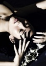
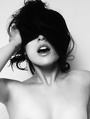
![https://modelmayhm-6.vo.llnwd.net/d1/photos/091205/20/4b1b2f403299e_m.jpg]()
The bright glare & strong shadow on her chest vs the hair in her face & their faces being shadowed is annoyingly distracting.
Her pose makes it look like she has no waist & gigantically fat hips. Not flattering.
*********************************************
https://www.modelmayhem.com/pic.php?pid … up_id=&ua= (18+)
Again here the sharp highlights vs the shadows are distracting, in this case because they don't flow with the lines of the body. Plus the pose grossly distorts her breasts.
*********************************************
![https://modelmayhm-6.vo.llnwd.net/d1/photos/090406/00/49d9ac263aef8_m.jpg]()
See above comments, plus I've seen other images of Roxy from this shoot & this isn't the best one as far as your work. Her profile's gone so I can't find the better one but I know this isn't it. And why is she making a weird half-wink?
*********************************************
See this?
https://www.modelmayhem.com/pic.php?pid … up_id=&ua= (18+)
You have some strong highlights & deep shadows on her but it WORKS 'cause it flows with her body & pose. Do it like that.
*********************************************
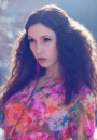
![https://modelmayhm-6.vo.llnwd.net/d1/photos/090215/15/4998a52737bb4_m.jpg]()
REALLY good, which's why I'ma pick on 2 details. Why didn't you PS out the tiny bit of stray hair on her chin & the clothing mark by her shoulder? Tiny details, that kept it from going from "really good" to "excellent."
*********************************************
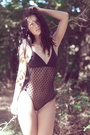
![https://modelmayhm-6.vo.llnwd.net/d1/photos/090308/22/49b4a5a679cb2_m.jpg]()
Crop it just below her shoulders & you have a great shot. Cropped like it is, we get distractingly hairy arms, a cliched handbra, and bad nailpolish.
*********************************************
![https://modelmayhm-6.vo.llnwd.net/d1/photos/090224/17/49a4a2de59297_m.jpg]()
That's perfect. Do that more.
*********************************************
https://www.modelmayhem.com/pic.php?pid … up_id=&ua= (18+)
It's a "meh" image over all, but I posted it to say "why the hell didn't you move the damn light?" Seriously distracting.
*********************************************
https://www.modelmayhem.com/pic.php?pid … up_id=&ua= (18+)
Were you using stage blood? If so, and if you're gonna use that level of desat, use chocolate syrup or raspberry syrup or something that TASTES good so they won't mind getting it in their mouths & can have a convincing bloody kiss, not a "must keep lips clenched 'cause this tastes like ass" look. And the smears on him look dabbed on, not natural.
*********************************************
![https://modelmayhm-6.vo.llnwd.net/d1/photos/091214/14/4b26b714a7f67_m.jpg]()
Mostly right. Her face is great, lighting's good, etc. Why is there a tripwire sticking out of her back in front of the wooden thing? Is she wired to explode?
*********************************************
https://www.modelmayhem.com/pic.php?pid … up_id=&ua= (18+)
I wanted to like it. It'd be decent if there wasn't a hook in her head.
*********************************************
https://www.modelmayhem.com/pic.php?pid … up_id=&ua= (18_)
Nice. Me personally I'd have used a reflector or some fill flash for a bit more on her face, but this works well. Do more.
*********************************************
![https://modelmayhm-6.vo.llnwd.net/d1/photos/081213/23/49448e9c03dd7_m.jpg]()
Not bad at all. One bitchy detail, the "JEFF" by itself above her head's ugly, I'd have gotten rid of it as a distraction. But generally it works.
*********************************************
![https://modelmayhm-6.vo.llnwd.net/d1/photos/091010/15/4ad10a5f7595b_m.jpg]()
Good solid glam shot. If you'd turned her hips & knees slightly to her right she could've hit the pose without creating the crease/wrinkle just above her waist, but it's minor. The straight-on hips just look a little awkward.
*********************************************
Why isn't THIS:
![https://photos.modelmayhem.com/photos/090228/10/49a9876f5b191_m.jpg]()
in your portfolio?
*********************************************
https://www.modelmayhem.com/pic.php?pid … =59992&ua=(18+)
You got the lighting right HERE. 
So why not in your AV? Same set.
*********************************************
The black & white strip outfit looks better in both the images in Melissa's portfolio than the one in yours.
*********************************************
You remind me of me a little. You've got great ideas & concepts, and you crank out some real winners. You also trip yourself up by overlooking lighting issues & background details... my 2 biggest gremlins. Take a little more time & strive for some consistency on the tech aspects without stifling the creativity.
If you want to be taken seriously rather than as just casual & fun, address some of the issues in your profile & website.
If you have 1 really good photo & one "meh" photo from a set, and the model is here & posting, it IS ok for both of you to post the same GOOD one instead of the model posting the good one & you posting one that should've stayed at the bottom of the pile. Most people won't look at that list to see more.
You got potential, now clean it up.
Photographer
jesse paulk
Posts: 3712
Phoenix, Arizona, US
wow thanks SLE. my website and mm port have fallen behind, i've just been doing DA recently. im still learning the new equipment. and with new PS techniques, i have to go back and redo poorly done edits. thank you again for the thorough critique  as for the blood, it was homemade, was slightly bitter but more or less tasted like chocolate. the wire in her back were tire snowchains. why they were in a phoenix, az "for lease" building, i dont know...

Photographer
FootNote Fotography
Posts: 18809
Gainesville, Florida, US

Hayley MacCormick wrote:
Me please Probably should read the first post 
Model
Hayley MacCormick
Posts: 24
Wellington, Wellington, New Zealand
hahaha yes i should have!! silly me!! thanks!!
Photographer
SLE Photography
Posts: 68937
Orlando, Florida, US
Hayley MacCormick wrote:
Me please Ok. Strictly 'cause I'm a nice guy & you were posting from the bottom of the world where time works differently...
Starting with your profile, this sentence:
"My passion is catwalk but I am hoping to get into more photography side of modeling."
I don't know about NZ, but I know in most of the world 5'5" is too short for most catwalk work other than the occasional charity event & runway show. When you say "photography side," are you looking to BECOME a photographer? Or are you looking to get in to PRINT work? At your height & with your look I'm guessing you mean commercial? Thing is, I shouldn't HAVE to guess, you need to be clear.
Your profile's got some unneeded fluff in it & is missing important info like when you're available, what areas you're available in, etc.
Check this out:
The Complete Newbie's Guide to Your Online Profile
As for your portfolio, you've got the one pageant shot that doesn't really do much for you. Honestly, pageant images lend nothing. The ENTIRE rest of your portfolio is from a SINGLE shoot, and the photographer overexposed, soft-filtered, and plasticized your face in EVERY frame.
#1, you don't need that many images form one shoot, especially that many REDUNDANT images. This article's aimed at photographers, but there's advice in it that applies here:
[urlhttp://photofocus.com/2009/12/19/become-a-better-photographer-by-taking-fewer-shots/]Become a Better Photographer by Taking Fewer Shots[/url]
Specifically:
"It is indicative of a mentality that exists in societyâ¦not only is size king, but so is quantity."
It's not true.
Pare your portfolio down to the best 4 or 5 shots from that set. No dupes f any one outfit or similar poses.
This one:
![https://modelmayhm-4.vo.llnwd.net/d1/photos/091219/20/4b2daaa33e9ad_m.jpg]()
needs to be the first casualty. See what you're doing with your face there, tucking your chin & looking down? Never do that again. You make your nose look wide & your face look huge & round, especially against your hairdo.
On that note, we don't need to see in your nose, either:
![https://modelmayhm-4.vo.llnwd.net/d1/photos/091221/16/4b300e5531c75_m.jpg]()
Not to mention the ugly shadows that makes under your chin.
As far as the rest of the images there & what you should get rid of + what you should be replacing them with, at 5'5" you're going to get an awful lot of offers for nude/glamour. It's where you're most easily marketable. I see that you don't want to go that route & that's fine... but that means you need to NOT have 1/2 your images be you in lingerie in "sexy" poses. Look at catalogs of clothing, that's the sort of look you need to go for if you want commercial/print. Try & find photographers that can shoot that, even if you have to save up & pay a couple of them.
For now, besides getting rid of most of those images, get a friend with a digital camera to take a clear, not overly lit, shot of your face, straight on, no makeup, and put it in there so people can SEE your face without blown highlights & too much photo shop.
That's about it, good luck!
Photographer
SLE Photography
Posts: 68937
Orlando, Florida, US
Alycia Gallagher wrote:
i wishhhhhhh I have free time today since a model bailed on a shoot. I've got to go do some errands but when I come back I'll see about doing a few more, ok? You're first in line.
Model
Gemma Pepper
Posts: 61
Nottingham, England, United Kingdom
could you do me too?? pleaseee xxx

Photographer
H E R B L I S H
Posts: 15189
Orlando, Florida, US
Gemma Pepper wrote:
could you do me too?? pleaseee xxx He he he!
Photographer
SLE Photography
Posts: 68937
Orlando, Florida, US
Gemma Pepper wrote:
could you do me too?? pleaseee xxx Yup. You're #2 in line after my errands.

Model
Miss SM
Posts: 1737
Portland, Maine, US
*gets in line*
Photographer
FootNote Fotography
Posts: 18809
Gainesville, Florida, US
SLE Photography wrote:
Yup. You're #2 in line after my errands. I feel so cheated
Model
Natalie Swift
Posts: 1582
Naples, Florida, US
Me? after your errands?

Model
TrackBelle
Posts: 4497
San Francisco, California, US
You've critiqued my before but I'm wondering if you have any new thoughts or revelations?
Photographer
SLE Photography
Posts: 68937
Orlando, Florida, US
Alycia Gallagher wrote:
i wishhhhhhh Can we have a little more info in your profile please? What kind of work are you available for/interested in? Are you agency-repped (you have the stats for it)? What's your availability time/location wise?
**********************************************
This looks like a goof:
![https://modelmayhm-3.vo.llnwd.net/d1/photos/090925/09/4abcf13841809_m.jpg]()
Doesn't fit the rest of your book.
**********************************************
This's a great shot for the photographer:
![https://modelmayhm-3.vo.llnwd.net/d1/photos/090423/13/49f0cd7bc06ef_m.jpg]()
Doesn't do much to show you off.
**********************************************
You're tall with gorgeous long legs. Why is there only ONE full length shot of you? (And one where your leg's awkwardly chopped off.)
**********************************************
What does your hair look like NOW? And your face is heavily made up and/or shopped in all your images. May we please have a clean headshot with your current hair?
Photographer
Shades Of Gray
Posts: 1054
Colorado Springs, Colorado, US
If you're not asleep, count me in

Model
ElleV
Posts: 3343
San Antonio, Texas, US
In line. Btw, sorry your model flaked. 
Photographer
BARBARA VON TRAUMER
Posts: 31
Las Vegas, Nevada, US
Waiting 'til the lower back hurts. Gotta sleep too...thanks. Barb.
Photographer
SLE Photography
Posts: 68937
Orlando, Florida, US
Gemma Pepper wrote:
could you do me too?? pleaseee xxx WTF is wrong with your profile?? Seriously?? Do you expect anyone to scroll thru all those images from photographers you're planning to shoot with before they reach your brief bio that's missing critical info, then skip past the cutesy "visitors" box to get to your experience? Cut that out. And quit putting images that're in your portfolio in your profile. Less is more there.
**********************************************
Now for your portfolio. WAYYYYY too much of a pain with the albums & then the images. Try just organizing them in to groups.
**********************************************
You have 3 different hair colors & styles in your portfolio. What is it NOW? We need to know this.
**********************************************
You have 2 pics in the pink hat, that's at least 1 too many. Kill one of them, preferably the one where we're looking up your nose. Ditto for the broken mirror & cling wrap shots.
**********************************************
You have GOT to work on your expressions. Sorry, but I see MAYBE 2 expressions in your images, they're extremely wooden & inexpressive.
**********************************************
On that note, this image is an abomination:
![https://modelmayhm-4.vo.llnwd.net/d1/photos/091103/17/4af0d57b97705_m.jpg]()
Shitty lighting, bad photo shop, blurred all to hell, and it looks like someone pointed a gun at your head & said "SMILE, DAMMIT!" That's the phoniest expression I've ever seen.
**********************************************
Speaking of you looking terrified:
![https://modelmayhm-4.vo.llnwd.net/d1/photos/091103/17/4af0d88b65ae5_m.jpg]()
![https://modelmayhm-4.vo.llnwd.net/d1/photos/091103/17/4af0d6f2bbbf7_m.jpg]()
Stop it.
**********************************************
WHY are you wearing these?
![https://modelmayhm-4.vo.llnwd.net/d1/photos/091120/01/4b0660b25ffb8_m.jpg]()
You have a cute butt. This pic not only doesn't SHOW it, it looks like you're wearing a full diaper. Delete the photo & burn those shorts.
(The other shot in them:
![https://modelmayhm-4.vo.llnwd.net/d1/photos/091220/11/4b2e76658cb5a_m.jpg]()
sucks too)
**********************************************
WTH is going on here?
![https://modelmayhm-4.vo.llnwd.net/d1/photos/091024/16/4ae38b60641ac_m.jpg]()
I've seen some shots like that with A model where we can see some of her & what she's doing thru the material. With 2 of you AND the opacity it's just a blob. This does nothing for you.
**********************************************
I just noticed you pose in several images with a guy who's got almost all the same bad profile layout habits going that you do. It'd make me wonder if one of you is controlling the other's profile/managing the other, or if you both have someone "managing" you and running your profile. Doesn't look promising.
**********************************************
This's tacky & cliched:
![https://modelmayhm-4.vo.llnwd.net/d1/photos/091023/01/4ae1678bc2d15_m.jpg]()
and it's not a good photo.
**********************************************
This does awful things to your hips & thighs:
![https://modelmayhm-4.vo.llnwd.net/d1/photos/091104/21/4af25eae7efe7_m.jpg]()
I think those're ugly, but if you're gonna wear them you sure as heck shouldn't square your hips to the camera.
**********************************************
I just don't get it:
![https://modelmayhm-4.vo.llnwd.net/d1/photos/091220/10/4b2e6c9db13cb_m.jpg]()
It's not a good photo.
**********************************************
Overall, your portfolio doesn't know where it's going. Are you a glam model? An alt model? A fetish model? We don't know, and your portfolio & profile aren't doing a good job of telling us. Maybe split your genres? Or explain it better in your profile & group the images in your portfolio?
**********************************************
You have worked with some TERRIBLE photographers, including way too many people who need to back off the photoshop. A number of your images don't show YOU as a model, are just low quality, or are so shopped they're useless in your book. This's especially true of almost all your glam shots.
**********************************************
Work on your expressions. This's critical. Stop posing in clothes that aren't flattering. Work with some better photographers who understand to back off the PS and let you have human skin instead of doll-mask face. Learn to select what you display better, you don't need to put up images from evry photographer or every shoot if you don't look good. Fix your profile, and figure out a direction to market yourself in.
Photographer
SLE Photography
Posts: 68937
Orlando, Florida, US
FootNote Fotography wrote:
I feel so cheated YOU didn't ask. Get in line.
Photographer
SLE Photography
Posts: 68937
Orlando, Florida, US
Stephanie M wrote:
*gets in line* YAY! A sensible, concise, and informative profile! A+, I like you already.
**********************************************
More photos that show you other than from mid-torso up, please. You've got a lovely face, but let's see a bit more of the rest of you.
**********************************************
Look at the gap between your sweater & panties:
![https://modelmayhm-2.vo.llnwd.net/d1/photos/091221/15/4b3003ca350c3_m.jpg]()
Don't bend forward that far.
**********************************************
Really dramatic eyes here:
![https://modelmayhm-2.vo.llnwd.net/d1/photos/090630/18/4a4ab9306b195_m.jpg]()
But some other tech aspects of the image are less than favorable & the huge watermark makes it look like an ad for him, not you.
**********************************************
This
![https://modelmayhm-2.vo.llnwd.net/d1/photos/090712/17/4a5a831243323_m.jpg]()
whites out much of your face & your eyes are out of focus.
**********************************************
Random guy leg?
![https://modelmayhm-2.vo.llnwd.net/d1/photos/091031/18/4aece218e33f2_m.jpg]()
Stalker? LOL
**********************************************
The watermark's still obnoxious but this
![https://modelmayhm-2.vo.llnwd.net/d1/photos/091213/16/4b2589ffa459f_m.jpg]() \ \
is a much better commercial type image & the watermark being at the bottom means it's not as obnoxious. Good expression.
**********************************************
BAD expression:
![https://modelmayhm-2.vo.llnwd.net/d1/photos/090805/09/4a79afc9a3628_m.jpg]()
It just doesn't go with the concept/look of the image. Smoldering & sexy, sure. Smirking? Not so much.
**********************************************
MUCH cooler image:
![https://modelmayhm-2.vo.llnwd.net/d1/photos/090906/12/4aa4133aa18c9_m.jpg]()
Same set, but this works.
**********************************************
This's just adorable:
![https://modelmayhm-2.vo.llnwd.net/d1/photos/090620/15/4a3d5cd5180b6_m.jpg]()
**********************************************
This's very cool:
![https://modelmayhm-2.vo.llnwd.net/d1/photos/090616/20/4a3869b3c7abe_m.jpg]()
**********************************************
One thing I CAN'T tell from your book or profile is what you WANT? What're you doing, what're you aiming for? You've got some good stuff, and a few directions you can go. Build it up & wow me. You say you want paid work, but I'm honestly not seeing a lot that'd merit pay. To get paid, you need to either give looks that'll improve a photographer's portfolio or images he can sell. I see few of either but there're some things you can do to change that. Come back in 6 months.
Model
Miss SM
Posts: 1737
Portland, Maine, US
SLE Photography wrote:
One thing I CAN'T tell from your book or profile is what you WANT? What're you doing, what're you aiming for? You've got some good stuff, and a few directions you can go. Build it up & wow me. You say you want paid work, but I'm honestly not seeing a lot that'd merit pay. To get paid, you need to either give looks that'll improve a photographer's portfolio or images he can sell. I see few of either but there're some things you can do to change that. Come back in 6 months. thanks deleted the smirky one. I guess I'm still figuring it out as well!
Photographer
SLE Photography
Posts: 68937
Orlando, Florida, US
Taking a break for a bit. More later.
Photographer
closed up shop
Posts: 3176
Philadelphia, Pennsylvania, US
My portfolio has a magic anti-critique curse on it. Perhaps, you are the chosen one. The one to fill the prophecy laid down by the elders of Model Mayhem. Yes, I sense that you are rousing from the darkness of sleep to fight this untamed collection of pictures. Jump on the nearest luck dragon and fly on back.
(I am tired too.)
Artist/Painter
inklusions
Posts: 614
Odessa, Texas, US
Model
Aly Gallagher
Posts: 811
Halifax, Nova Scotia, Canada
Thank you, all points taken into consideration
Model
Nichole Hopkins
Posts: 2997
Los Angeles, California, US
Please if your still going
Model
KatiexMarie
Posts: 274
London, England, United Kingdom
please do me
Photographer
SLE Photography
Posts: 68937
Orlando, Florida, US
FootNote Fotography wrote:
Probably should read the first post Ok, since you're feeling skipped
Starting with your website & profile, clean up & clarify your verbiage.
"FootNote Photography
This is my website. I am Michael West. I have been doing photography for a few years now on and off and am currently working on a couple different projects.
Please contact me for rates, or any questions you may have."
Yep. We know it's your website. That's kinda obvious. A little more info, even a LITTLE, is more apt to attract attention than a request
Speaking of redundancy, this:
"Current info: I am currently out of the country, I am planning a trip on the east coast of the US when I take a vacation home. "
Well yeah, if it's current, then it's currently.
You also have extra BB code tags in there, those should be cleaned up.
Otherwise, details in our profile are good.
-------------------------------------------------------
Bleh, albums.
Anything with a link is 18+
![https://modelmayhm-9.vo.llnwd.net/d1/photos/091102/08/4aef0b4f43f56_m.jpg]()
Love the picture.
It's a shit avatar. Horizontal AVs attract less attention than vertical. B&W attract less attention than color. Mostly black B&W avs with only one bright spot attract the least. If you want people to look at your work, using this image cripples you. Select something more eye catching.
-------------------------------------------------------
https://www.modelmayhem.com/pic.php?pid … =82930&ua=
Gorgeous. Silhouetted face, brilliantly highlighted tattoo, nice shadow detail, good tonal range.
And yet she's on a rumpled white bed that takes up too much of the frame. I'd crop more of it out to the bottom & the right, then burn it in a bit to look smoother & less distracting.
-------------------------------------------------------
![https://modelmayhm-9.vo.llnwd.net/d1/photos/090718/08/4a61f158716fb_m.jpg]()
Now see, the bed WORKS there. It fits the mood of the piece and complements the composition.
The ONLY detail I don't like in this one is the stray piece of hair on her right arm by the elbow. Looks like she cut herself.
-------------------------------------------------------
![https://modelmayhm-9.vo.llnwd.net/d1/photos/090225/08/49a56ec85cc22_m.jpg]()
You did it right. Just enough color in the tattoo.
-------------------------------------------------------
![https://modelmayhm-9.vo.llnwd.net/d1/photos/090225/08/49a56e625040b_m.jpg]()
Not bad. Nice to see one with a direct gaze.
I don't like the flash reflection in the wood, it's too close to her face & draws my eye away.
The light colored wall to the right also looks "off," especially with is so dark to the left that her foot vanishes. It looks like you got half a vignetting effect. Out of the images so far, the lighting's the furthest off here.
-------------------------------------------------------
![https://modelmayhm-9.vo.llnwd.net/d1/photos/090218/07/499c23ce3d083_m.jpg]()
Not bad. Their contrasting expressions suggest a story, it almost looks like the blonde's forcing herself on the reluctant brunette. The blonde's engagement ring doesn't suit the scene & it's distracting.
-------------------------------------------------------
![https://modelmayhm-9.vo.llnwd.net/d1/photos/080507/18/48222bd289381_m.jpg]()
Alison looks great. Only quibble, and it's minor, is that her eyes are a little muddy. I might've dodged the whites a touch, but that's personal preference.
I like the old film look.
-------------------------------------------------------
![https://modelmayhm-9.vo.llnwd.net/d1/photos/091224/14/4b33e47be74dd_m.jpg]()
Nosir. Don't like it.
Her pose looks awkward & staged, like a guy with a polaroid telling his wife "C;mon, look sexy!" Her neck's torqued a bit too hard, giving harsh skin lines. Her left arm's under too much tension supporting her. Her chin's awkwardly cut off by her right bicep. Rotating her a few degrees to the right would've smoothed it out.
The headboard's out of balance with too much wall to the right of it.
You've done much better with the shadows & controlled lighting in your other images.
-------------------------------------------------------
![https://modelmayhm-9.vo.llnwd.net/d1/photos/090818/16/4a8b35fab16a5_m.jpg]()
I don't get it. Decent composition & lighting. Could be dramatic. She looks like she's asking you "What am I supposed to do now?"
-------------------------------------------------------
![https://modelmayhm-9.vo.llnwd.net/d1/photos/090718/09/4a61f1b742815_m.jpg]()
Better. The slightly turned away face, the hand positioned on the partially open shirt, those all hint at a story.
-------------------------------------------------------
![https://modelmayhm-9.vo.llnwd.net/d1/photos/090218/07/499c236a319fd_m.jpg]()
Nice. Rachel looks good. Pose, lighting, and color make sense. WTF is eating her left hand? The invisible black block of doom?
I have the same problem with this inage out of my own book:
https://www.modelmayhem.com/pic.php?pid … up_id=&ua=
Tori (the girl up top) just LOSES her hand behind a piece of tree that turned black in processing. I still like the picture, but that detail always bothers me & makes me hesitant to post this.
Also, the pillow needs to go.
-------------------------------------------------------
The mouse picture's a cute DoF exercise. Why the hell's it in your "Lingerie" album as well as your main gallery?
-------------------------------------------------------
It's hard to say much tech wise about pinhole shots, so I'll leave it at saying I think in terms of composition, the light, etc, this's the strongest:
![https://modelmayhm-9.vo.llnwd.net/d1/photos/080527/19/483c9cba9f087_m.jpg]()
-------------------------------------------------------
![https://modelmayhm-9.vo.llnwd.net/d1/photos/090721/12/4a661c9af1667_m.jpg]()
Uh...  I want to slap a LOLCat caption on it... "Whut I hear?" I want to slap a LOLCat caption on it... "Whut I hear?"
The colors & comp don't work for me. The darker red background makes her candy pink lipstick look sickly against her skin. Her face & hair are nice & crisp, but her shoulder lines blur in to the background like there was some weird 'shopping going on. This doesn't fit the rest of your work. Looks like you slapped it in your portfolio just to have a color image.
-------------------------------------------------------
![https://modelmayhm-9.vo.llnwd.net/d1/photos/090501/19/49fbb2832bf15_m.jpg]()
You did it right. Rwwwar.
-------------------------------------------------------
![https://modelmayhm-9.vo.llnwd.net/d1/photos/090420/17/49ed16ff8fd0a_m.jpg]()
![https://modelmayhm-9.vo.llnwd.net/d1/photos/090420/17/49ed16ea4b1e1_m.jpg]()
They're both good, but the second one is SO strong that it makes the first pale by comparison. They don't both belong in your portfolio at the same time, and certainly not adjacent.
Just one thing... in the second one, get rid of that stray little piece of white whatever on the left in her shadow.
-------------------------------------------------------
![https://modelmayhm-9.vo.llnwd.net/d1/photos/080504/20/481e5a911e5c1_m.jpg]()
You did it right. Perfect. This would make a better AV.
-------------------------------------------------------
![https://modelmayhm-9.vo.llnwd.net/d1/photos/080504/20/481e599c153d5_m.jpg]()
See her eyes? That's how Alison's eyes should look.
I don't like the bra strap, but that's a personal pref. This'd also make a better AV.
-------------------------------------------------------
![https://modelmayhm-9.vo.llnwd.net/d1/photos/070816/00/46c3e319a1a17_m.jpg]()
Full of win, as one of your listers said. Great lighting, leaves you wondering about the story, strong comp, brilliant use of shallow DoF to blur out the woman in the background & add mystery. Firing on all cylinders.
-------------------------------------------------------
https://www.modelmayhem.com/pic.php?pid … up_id=&ua=
NICE bondage shot. The fall of light across the rope, the way the image steadily darkens towards the background, all well done.
I'd like to see you throw this one in Oni's rope bondage thread.
-------------------------------------------------------
![https://modelmayhm-9.vo.llnwd.net/d1/photos/100103/18/4b4152a27e1f9_m.jpg]()
Given the overall quality of your models, I don't get it. This bitch is a DOG.

Makeup Artist
Hannah OBrien
Posts: 334
Brisbane, Queensland, Australia
Would love to know your thoughts on a MUA's port!
Photographer
SLE Photography
Posts: 68937
Orlando, Florida, US
Natalie Swift wrote:
Me? after your errands? Your turn in the barrel.
Profile's not bad, a little thin but since you're taking a break it's cool. But SHAME ON YOU. No maternity modeling? Bad model! *smack smack*
Speaking of "bad model," you link out to both deviantArt and Facebok... two sites that demand cookies AND restrict pic access. If you're going to have links out to other sites, at least pick one that doesn't require cookies or restrict non-members (unless you set them), like Flickr. Or spend a couple bucks a year for webspace.
Your detailed credits list is good but scrolls a bit long. See how I double stacked model names in mine? And maybe condense the spacing in your publications, use BOLD to show the start of a new line.
------------------------------------------------------------
Yay for no albums! Anything linked is 18+
I skipped a few that're solid images with nothing much to say one way or the other.
------------------------------------------------------------
![https://modelmayhm-4.vo.llnwd.net/d1/photos/091221/12/4b2fdeef3345c_m.jpg]()
Yow. Great pose, smoking expression. This one stands out enough that it skips right over what I just said to Footnote about B&W horizontal AVs.
------------------------------------------------------------
![https://modelmayhm-4.vo.llnwd.net/d1/photos/091213/12/4b255498c672e_m.jpg]()
I never quite get images like this in a model's portfolio. You have a lovely striking face. The two images I skipped right before this show it off fantastically. This could be ANYONE'S face. It's great in an MUA's port but I don't see what it does for you.
------------------------------------------------------------
![https://modelmayhm-4.vo.llnwd.net/d1/photos/090109/21/49682efa4c7f7_m.jpg]()
This, on the other hand, shows your face off great with the shallow DoF.
------------------------------------------------------------
![https://modelmayhm-4.vo.llnwd.net/d1/photos/090903/20/4aa084afd71eb_m.jpg]()
![https://modelmayhm-4.vo.llnwd.net/d1/photos/081221/00/494df7811db2e_m.jpg]()
See what I said up there to Footnote about 2 overly similar images right next to each other? Same thing. Split them up, or ditch one. I'd keep the one with the cloth because it stands out better against some other similar poses.
------------------------------------------------------------
![https://modelmayhm-4.vo.llnwd.net/d1/photos/090101/19/495d8cb6ddc18_m.jpg]()
See, the elaborate makeup WORKS here 'cause we can see more of your face PLUS your hands. It's more emotive & something's going on.
While the overall image is cool, the bottom shot with the raspberries is stronger, I'd almost rather see it solo if the photographer gave it to you.
------------------------------------------------------------
![https://modelmayhm-4.vo.llnwd.net/d1/photos/090823/17/4a91d9e7b4f23_m.jpg]()
I like the left half. See your breasts in the right half? You're too experienced of a model to make that mistake. That pose combined with that outfit leave your breasts looking lumpy & lopsided.
------------------------------------------------------------
https://www.modelmayhem.com/pic.php?pid … up_id=&ua=
Flawless. That's how to make your body look fantastic, and you didn't cover or shadow your face the way a lot of models do when they try that.
------------------------------------------------------------
https://www.modelmayhem.com/pic.php?pid … up_id=&ua=
Cute. Nice to see a serious model who can still do a fun & playful shot.
------------------------------------------------------------
https://www.modelmayhem.com/pic.php?pid … up_id=&ua=
I'm not gonna blame you for the photographer, and YOU do a great job selling the image, but I have issues with the technique in the finishing here that bothers me looking at the photo. Still, you look good enough that it'll only bother obnoxious nitpickers like me.
------------------------------------------------------------
https://www.modelmayhem.com/pic.php?pid … up_id=&ua=
You look really awkward & uncomfortable here. It hurts the flow of the image. You should check out some of Bellabrooke's work, she has a way of blending in to the scenery in shots like this that's flawless.
------------------------------------------------------------
![https://modelmayhm-4.vo.llnwd.net/d1/photos/090101/19/495d8dc5cf556_m.jpg]()
Same set as your AV, not as good as your AV. Redundancy is not your friend.
Also, I just realized almost all your full length or waist up profile shots are of your left side. Is that on purpose?
------------------------------------------------------------
![https://modelmayhm-4.vo.llnwd.net/d1/photos/090903/20/4aa084d3ebc4c_m.jpg]()
This's one of those "good for the photographer, doesn't do much for the model" shots. If it were closer on you to show your expression & drama of the pose, great. Otherwise, meh. Plus I don't like the lines of the clothes.
------------------------------------------------------------
![https://modelmayhm-4.vo.llnwd.net/d1/photos/090903/20/4aa0848ce7d87_m.jpg]()
See, THIS is far back, but the vignetting in the lighting & flow of the image makes you the center. Your pose draws attention to you, especially with your limbs projecting from the dark dress, and the half silhouette makes your face stand out.
------------------------------------------------------------
![https://modelmayhm-4.vo.llnwd.net/d1/photos/091012/21/4ad4021823274_m.jpg]()
Don't like it. Pose is awkward, and the photographer didn't do a great job with the lighting.
------------------------------------------------------------
![https://modelmayhm-4.vo.llnwd.net/d1/photos/080914/01/48cca48be5a06_m.jpg]()
This's fantastic. You made a tough pose look effortless and smooth. This's the opposite, comfort wise, from the picture in the rocks. I usually scream about blown highlights but in this case the photographer knows what he's doing and something that would've sucked if it'd been an accident became part of molding the lines of your body to make you look like a porcelain sculpture.
------------------------------------------------------------
Come back soon! Do maternity shots!
Model
B Debauchery
Posts: 5744
Boston, Massachusetts, US
Would love to hear your opinion
Photographer
FootNote Fotography
Posts: 18809
Gainesville, Florida, US
SLE Photography wrote:
yada yada you suck at life yada yada See sometimes I do listen lol.
First off, the mouse and dog lol I forgot I uploaded them, I meant to do it only for a minute and then delete them so I could link them and show off my new lens lol.
I did some rearranging and did get rid of a few shots time to clean house, I dont know who Oni is or the bondage thread is though.
Photographer
SLE Photography
Posts: 68937
Orlando, Florida, US
FootNote Fotography wrote:
See sometimes I do listen lol.
First off, the mouse and dog lol I forgot I uploaded them, I meant to do it only for a minute and then delete them so I could link them and show off my new lens lol.
I did some rearranging and did get rid of a few shots time to clean house, I dont know who Oni is or the bondage thread is though. That would be here:
https://www.modelmayhem.com/po.php?thread_id=343242

Photographer
Savage Dream Studios
Posts: 259
Chicago, Illinois, US
i was gonna have you critique my drinking but i couldnt get away from work this week. ill be back in orlando in two months. we can drink and you can make fun of my work then
|


 I want to slap a LOLCat caption on it... "Whut I hear?"