|
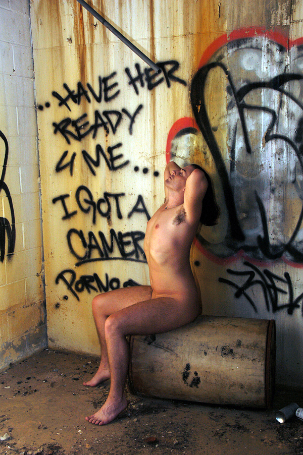
Please let me know how I can improve in regards to this photo: https://photos.modelmayhem.com/photos/0 … 244e84.jpg Jan 13 10 05:13 pm Link The image is rather static to me. The composition leaves quite a bit to be desired...the model is also completely centered within the image, and I don't find myself looking through the photo, just at the model. It looks as if the model was wearing some kind of undergarment that left a mark around their waist, which grabs my attention. And I feel as if the light could have been used better. There's light on the model's face and body, but everything else falls flat. Perhaps turning the model slightly against the light to do some side lighting would have created more interesting shadows. (and something seems just a tad bit off about the color, but color isn't a strong suit of mine in the least bit) Jan 13 10 05:17 pm Link Laura Ann Experimental wrote: Thank you! I am really trying to improve on the rule of thirds. When I do nudes, I try to have the model wear loose fitting clothing prior. Jan 13 10 05:23 pm Link House of Nudes wrote: I do think positioning the model to the right would have helped...keeping the log at the edge of the page. The corner of the could be used as a way to anchor and balance the image. Jan 13 10 05:27 pm Link Laura Ann Experimental wrote: You are welcome to judge! I am open to all critiques and I agree with you. Jan 13 10 05:29 pm Link I think there is just too much going on. You haven't made any choices. 90% of photography is editing what the viewer will perceive. You don't seem to be editing in this shot, you have the kitchen sink in there, it's static, nothing flows. Jan 13 10 08:45 pm Link |


