|
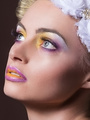
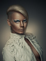
Oct 17 14 11:11 pm Link Yellowlines wrote: The forehead is blown out. Try to see if you can save texture there, and if yes darken the area to match the rest of the face. If not you have to do it the long way and do both colour correction and texture cloning. Oct 18 14 09:06 am Link Looks a bit dirty. Colors and brightness blotchy. Cheeks, body, forehead, cheekbones - all have different color. Need to fix it. Make b&w and you will see all problem with brightness blotchy. Nov 09 14 03:05 am Link Iris work is beautiful. If you can keep the whole thing black and white you won't have to deal with the orange-nss or color casts. It would work nicely as a BW. Evenout asymmetry on the shadows tho. Nov 23 14 06:32 pm Link Too much blue in the high lights  Dec 13 14 09:46 pm Link I don't like the coloring at all but the overall retouching is nice. Dec 15 14 05:14 am Link Viewers of images tend to look at the brightest parts of the picture after doing a quick scan of the image. There are so many areas of your image that are bright and nearly blown out...that the viewer ends up concentrating on that part of the image. It distracts the eye. One way to partially tone down the image... might be to make a duplicate of the overall image on a separate layer. Put this layer in multiply blend mode...and then reduce the layer opacity of that layer to approx 17%. If you wanted...you could also add a black mask mask to that layer so that the darkening effect is hidden. Then... paint on that black mask with a soft, 8% opacity, white brush, over the face and bright areas. That way you can selectively add in this darkening effect just where you want it... and however intense you want it to be. In the end...you may need to resort to "curve adjustment layers" to bring down the brightness alot and with good visual control. Also, if there is no texture in the blown out areas...then you will also need to add in some skin texture for it to look real...you may even have to use a curve adjustment layer to color correct the areas so they match as well. This image may take some effort. If it is a trophy image...then spend the time on it. Wish you the best. Jan 24 15 11:18 am Link You need to invest in a better monitor. I believe your monitor is a bit too old to display the right contrast and brightness. Jan 24 15 09:40 pm Link |