|
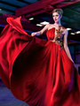
So I've always wanted to experiment with the desaturated look that you sometimes see in magazines. Viewing a few Youtube videos, one recommendation was to add blues to the shadows and yellows to the highlights. So... I took this image and started with cleanup, then D&B, then worked in some desaturation and color toning. So tell me... what would be your suggestions here?? I've never processed in this style... so this is a first for me.  Mar 10 15 06:37 pm Link I like the shot very much, but am at a slight loss on advise on ways to improve the look. I don't know if this is the best type image to use as a low saturation look, it seems to be shot pretty late in the day, which makes it naturally a little low saturation wise to begin with, but with a cool background, I like that used as some additional separation of foreground/background. What I've thought is slightly darker skin tones, a lighter dress and tone down the blurry highlight from the window frame. Mar 11 15 04:24 pm Link I like the pose I hate the background but the atmosphere is good I think. If you wanna make a fashion look image, don't forget to up the black point a little bit in curves layer. Dodge and Burn is very important, less color or normal color also works depends on the image. You can play with curves, selective color or color balance etc. to add desired look to the image. Focus on the clothes! Mar 12 15 11:48 am Link This might not be the best image to use to evaluate this technique. Her skin tonality is fairly dark where you want to add the blue contamination. Adding a blue cast to the darks would risk infecting her skin tones alot. So you have to selectively add blues...but there are not many areas to do that in except maybe the hair...I wouldnt want to see any blue cast in the skin. The dress is bright blue...it is SO prominent that you may not see the blue in the other darks very much in comparison. The blue dress steals away the show! The background is also blue...stealing away the cross processed blues that you want to add. You could add in the blue cross processing tones to the darkest part of the image...which is the hair. But there is already so much blue around it...that you would not notice it much. There are not very many natural white highlight tones in this original image to add a yellow cast to. The image is rather low contrast to begin with. The split or cross processed tones get added to the very deep blacks and the very white highlights. You dont have very many good highlights that are almost blown out in this image. I also agree with a previous poster...the yellow highlight to the left robs the attention away from the face... and makes you look at IT. Clone it out so it doesnt steal the show. So, on the image choice: Another lighter, stronger toned, somewhat more contrasty, more lighter skinned image, with good darks and highlights in the original image to begin with... may show up your technique and efforts better. Your cross processing doesnt show up very strongly on this example. The dress and the building steal the blues effect away...and you dont have enough nearly blown out highlights in this image to yellow up. (Cross processing refers to the film developing days... when the darkroom technician put the slide film into the wrong chemicals made for processing print film...or the print film was put into the slide films chemicals by mistake. The result was that we got back ruined, off color images, that were blueish in the darks and yellow in the highlights as a result of crossing up the chemicals. Thus the term Cross Processing.) Apr 01 15 04:11 pm Link TMA Photo and Retouch wrote: Thanks to everyone for the tips and suggestions! It's how we get better. All advice is appreciated and well received. Thanks! Apr 28 15 03:54 pm Link |