|
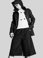
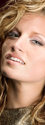
I've been retouching these past few days and I'm pretty happy with the results but there's always room for some critiques. I specially have problems with brightnes/contrast and color correction. I usually don't know if the image is ok the way it is, or if I went too far. Any opinion is very very very welcome.   I had A LOT of problems with the hair here. I had to clone a lot of it and changing the background was a total nightmare. I'm not sure if it turned out the way I wanted.  This was an easier photo, actually. I pretty much just cleaned the whole picture. I'm just worried about the contrast. How much do you think these kind of images need? I feel like it's a little bit saturated too.  Not sure about this one. I feel like the makeup is too much. I cleaned her whole face and added a few freckles around her nose and checks.  I'm happy with this one but I feel like it's too pink and maybe too bright?  The hair of one of these girls was a nightmare too. I also feel it looks too saturated. :S Mar 23 15 10:36 am Link My opinion is that you have done very well on all these diverse images. The faces and skin all have nice texture and brightness and contrast and stand out. Your retouches are nice and clean and make the images look polished and professional. The main things I can suggest on the brightness and contrast and color is to be sure your monitor is color calibrated with a "hardware puck and software monitor profiler". Having a monitor that is displaying accurate B+W tonalities, luminance and colors.... will make certain that your images are likewise the correct tone and color. You can often "borrow or rent" a Spyder or other monitor profiler every 1-3 months to check that your monitor is accurately showing you the correct tones and colors. A proven accurate monitor gives you Confidence that your work is correct! The images you are working on all depend on accurate tonality to look right. A second suggestion is to close your images for two or three days... and dont look at them. When I open the images again... I often see things that totally escaped my first impression of the retouch. Sometimes I get so emotionally focused on the retouch at the time... that I dont seem to be seeing things objectively. Image #1: I love the face and especially the highlights on image 1. The hair is always challenging and takes a long time to do! I get caught up in the face so much that I dont seem to mind the hair issues. The edge hair stubbles on the left side might be 15% shorter so I dont find myself looking at them after im done with the face. They seem to be just a bit obvious and would enjoy them cut back or faded into white just a little Image 3: I like image 3...but the eye sockets are a bit too dark and receding for me. I would love to see them lightened up a bit with a curves adjustment layer so they stood out more and came forward in the image more. Its the eyes that grab my attention in a portrait first. Keep posting here...its a good place to check things out. I like your face work. Good quality and artistry. Apr 01 15 03:31 pm Link |