|
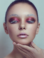
Any takers? I feel as if this is my best image and I've decided to niche in commercial and editorial beauty. Let me know what you think  Just trying to see if there's anything I need to keep my eye on as I push on - Just trying to see if there's anything I need to keep my eye on as I push on - [ Before ] - http://oi61.tinypic.com/24lpq83.jpg After -  Jun 12 15 10:49 am Link I like it, it's a good work. I would fix the oversaturated part on her chin/neck and eyebrows area but just a little bit. It looks you removed the shadow under her left eye but you forget under the right eye. That's a little bit too dark for me compared to the left eye. I would do those fixes but just a little bit to avoid the overcooked look. Jun 13 15 04:13 pm Link Thank you so much! Something kept bothering me about it and I couldn't tell what it was. I think you nailed it. Does anyone else have any critique? Jun 17 15 05:53 pm Link I like that its hi-key without blowing out features. It looks like you really smoothed her out and then replaced the lost pore texture. True? Jun 17 15 07:23 pm Link JBoyde wrote: Ah so that's what you call hi-key? Also yes in a way. I selectively high passed some parts that I felt were inconsistent/not sharp enough and tried to make it even. I also have a binding method I've been trying out with blurred noise on reverse hp where it just focuses on sort of micro burning/dodging the tiny 1px-3px spaces in between the pores if there's too much inconsistency. That's in addition to the d&b I do normally. Jun 18 15 08:27 am Link These are really beautiful images. Just cruisin' by here Jun 23 15 07:06 pm Link I think is very good job. I have begun getting very sensitive to the duck lips, now that so many models and even 'ordinary people' are getting injections and implants. Lips of young are what they are trying to get, and if you look at children, teens, even babies - you will see how the lips are naturally. They do not suddenly curl up like the duck bill. After age 18 lips start the 'deflating' process. Even for Angelina Jolie, no matter who you are. If someone is unfortunate enought to have lips that DO naturally look like duck's, we can still make them look natural. Same as any other weird flaw. Sep 02 15 05:49 pm Link For me they look beautiful. I like the highlights especially and there is a clean overall look. The eye and lips colors are beautiful as well...and the gold. So...Nice work...very attractive and high power images!! The far eye was a bit out of focus and a bit darker in the original...and I also like how you balanced the eyes with brightness and sharpness. Dec 05 15 03:59 pm Link The whole camera right of the image is cyan - desaturated compared to the rest of the image where the skin is much more red. The neck/chin transition is orange and much more saturated that the rest of the image. You need to add some blue to balance this area. The outer corner of her lip has a strange orangey line on the top and bottom lip. For a beauty image such as this, I would rework the eyelashes : fill up the obvious gaps with copied eyelashes. The eyebrows are not the same colour, especially the inner corner of camera right, it's yellow/orange when the other eyebrow is much more cyan. You changed the shape of the camera right inner corner of the eyebrow too much. Look at the original, it was much thicker and looked better. I would remove the mole behind the lip. Not because it's a mole, just because it looks like a weird bump in this area. Dont intensify the colour of the eye so much and dont lighten the highlights in the eyes so much, it looks fake. Reduce the shadow above her lip a little, it looks like a moustache. You removed the shadow that was constituting her cheekbones, it looks flat now. Liquify the shoulder a bit so it looks more rounded. (bring the higher part down) Mar 22 16 05:28 pm Link ^^^ Yeah~ I noticed that it looked super flat / lacking in depth and a series of other things way later, lmao. Thank you. I'll use this as a reminder. Thank god I know better now. Mar 23 16 11:08 am Link Kami Fore wrote: ooops, didnt realise how old this post was Mar 23 16 03:02 pm Link 9/10 Too much white going on in the picture. Unless that is what you were going for. May 23 16 06:08 pm Link Aspen Faye wrote: Totally agree with Aspen! Apr 11 17 06:13 pm Link |


