|
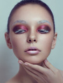
Hi guys, i have done a retouch of a photo that i find in MM from Lesya Leyman, very nice photographer. I try to note use FS only DB in this one, what do u guys think that i could improve on this one! Hope to reiceve some feedback to improve in the future.  Mar 29 16 10:53 am Link I think you are on the right track for the dodge and burn. There are still some areas that need attention (the neck, you could remove those two lines going accross her adam's apple / hair line, there is a lighter area that could be burnt a little more / some lighter blotches around the mouth). For dodge and burn, I advise you to start with a small zoom setting at first (image at normal viewing size or smaller, then work at this level of zoom). Once you have cleaned up at this level, zoom in a little and get into dodging and burning the details only if necessary (it will generally depend on the size of the output : magazine? bus stop add? etc..). The bigger it will be displayed the more you need to work on your image. It's not really useful to work on a really zoomed in image if it only prints at magazine size as you might actually make it too soft and lose texture. What does not work at all with your image is the colouring you chose. You need to check colour theory and how it applies. She is really red generally, then her face holds more yellow than her neck and chest. The cyan background and hair does not work either, you need to go back to something a bit more natural. I have the feeling you wanted to go for an RGB colour palette, but you made it far too intense and saturated, make it more subtle. Moreover, the face is darker than the chest, you dont want that. You want the light to be where you want the eyes of the viewer to go. Do not lighten the bottom half of iris the way you did, it's an amateur move, does not bring anything to the image, rather makes it unreal and looks like you did it because someone else told you to do in a crap tutorial rather than it being a creative decision (and those creative decisions need to make sense). Mar 29 16 12:05 pm Link OTTO many thanks for ur awesome and constructive feedback, its awesome when we can have people like u that help us to improve, many thanks. i really suck a color grading never know what to do, i have done some changes,what do u think?  Mar 29 16 01:22 pm Link It's a pleasure. The colour is much better now regarding the colour grading. You still need to check the colour and light discrepancy between face and chest. What I usually do is create 6 curves, one for each colour channel (I work in RGB) and paint on the mask like I would for dodge and burn. (for exemple, on your image, I would have a curve that allows me to add some yellow in the chest area, because yellow is the opposite of blue in RGB and CMYK, this way the chest would be more or less the same colour as the face. But you could do the opposite and add more blue in the face for it to be the colour of the chest). for reference, as a tool to remember which colour works with which (it always reads this way) : R - C = red is opposite to cyan G - M = green opposite to magenta B - Y = blue opposite to yellow K You have to realise that colour applies to three main areas, shadows, midtones and lights. Here, you can see that the highlights in the face (the lighter areas of her face are more yellow) are not the same colour as the ones in the chest (they appear to be more pinkish, meaning they hold more blue in the channel). Same with your shadows, the shoulders close to the neck are more orange and right under the chin is more cyan (it has less red). If what I am talking about does not make sense, read about how colours are created in photoshop in channels, this will help you work out how to colour correct an image. Also, look at really good images in reputed magazines, that will train your eyes for colours. Read about colour theory to know how to choose a colour palette. Read about luminosity masks to know how to apply your colour palette to the three main areas : shadow, midtones, lights. Read about colour, what composes it, how colours relate to each other and how the brain perceives it. A book I would advise you is Johannes Itten, the element of colour. You can easily find the pdf online now. You still need to work on your dodge and burn here. Dont make it so clean it looks fake but make it clean enough so no major "stains" catch the eye. Dont give up, you are on the right track. Mar 29 16 01:45 pm Link OTTO poste1...thanx  Apr 11 16 03:02 am Link Spend more time for D&B and color correction. Apr 12 16 09:02 pm Link |