|
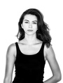
Just wanted to see what some people think of my images. I've only done 2 photo shoots as I mainly focus on automotive photography but I'd like to see if my portraits are decent enough in some strangers opinions! Thank you for your time! Oct 14 17 06:50 pm Link Your avatar works... Albeit the wardrobe is bunched together and your illumination is flat i.e. no shadowing to provide bias relief for the perception of depth in this two dimensional rendering... Also crop out the dead space at the top of the image, it lends nothing of compositional merit to the narrative The remainder of your images suffer from cluttered backgrounds and want of strong compositional elements... btw, you would benefit form having more than one model's imagery in your book before asking for feedback... Hope this helps... I wish you well on your journey... Oct 22 17 07:14 am Link I will second Thomas's comments above regarding your composition. There is a reason that most portraits are shot/cropped in portrait mode...it is the natural fit. There is nothing wrong with breaking that rule (or others) when the situation calls for it, but it is perhaps more rare than you think and there really ought to be a reason. In fact, in looking at your portfolio it seems you are going out of your way to break the rules without reason. There are times when lots of headroom above a subject really works well. This is not one of those cases.  There are times when foreground elements can really add to the mood and feel of an image and not just be distracting. This is not one of those cases. 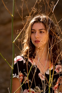 There is lots to like about this image, but the composition is not helping. There is a lot of weight/energy on the left side of this frame and absolutely nothing on the right side. Again, sometimes that really helps to create a positive tension, but I don't see it here. This just looks very unbalanced and the hinge next to her head is very distracting. Beautiful model, great soft light, lovely tones...so much to like...just wish the composition wasn't working against it.  This one is much closer to following traditional composition/graphic design rules and feels much more balanced. The large round window? helps to balance the composition with the model framed so far to the left. However, I don't see what it adds to the photo so why have it at all?  This one looks like a blooper. It's not a bad expression on the model's face, but clearly the arm demands alot of attention here...the question is WHY. Everything (the crop, the hair, the angle of the head) is leading the viewer towards the model's hand. Is that the intent?  As boring and academic as this may sound...I recommend you first strive to create a compelling portrait while following the traditional rules of composition and then break those rules very selectively in cases where the image really demands it. I hope that's helpful. Nov 15 17 11:03 am Link I'll tell you what: I can see that you know what you're doing with lighting. Let's start there. Depending on how much you are post-editing, your concepts of lighting are showing diversity. Your first shot shows a very straightforward flash shot, almost reminds me of 2000's, but then your use of yellows and backlighting, very 70's. Again, depending on amount of editing, your use of studio light is spot on, very straightforward and sellable, and definitely commercial enough for make-up shots, for example. You will experiment with more light and shadow to find more high fashion or abstract angles in the studio over time, but you are so far "doing it right." I see that you're obviously experimenting with what you can do with people instead of cars (secret is, they're the same, they all look great, but it depends on the lighting). Keep the experimentation, and study the photography of all eras so that you know when you are creating a style "on purpose," instead of just finding an 80's like image. You have to know that high contrast and heavy sunlight, black and white, and muted color celebrate that era, and the model and background may have to match to make it all make sense. But what's great, I think, is that you stretched this model out in just two shoots. No, not every image is gonna end up in a magazine, but none of them suck, she'd be happy as a client, and one or two of them are sellable. Coming out the gate, these are good compliments, definitely keep doing people. In terms of composure, I see you got some other comments, and that's maybe where I'd offer feedback. I agree that the shot with the dried grass in the foreground gets to be a bit much. Depend more on your background to tell the story, and be very reserved when you let a hot woman get covered in twigs. You have to make sure those sticks and grasses are totally totally totally part of the image or else it looks accidental. It gets a bit "bulky" as someone else comments, and I found myself looking for "her" in the shot, but was distracted by the background, foreground, outfit combo, lots of patterns. Keep in mind, if the model's close are complex, it takes away from the ease of the image and takes away from face. Do a guy in flannel, but only if you really want a lumberjack, otherwise he should be in a black t-shirt or a blue oxford or naked, that way it isn't about the clothes. I love the fence shot. Here you go more lifestyle and tell a story. Do NOT let modern photographers tell you all of your backgrounds should be blurry. I use a much shorter lens than most portraiters, because I LOVE backgrounds, and the model is a part of them. Don't let foregrounds and clothes distract from your beautiful surroundings and the face and body of your model. Now, the laundry shots. Here you've included the background, but not enough. Not enough of the girl, and I'm left wondering, wait, is she at a laundromat or is this an abstract concept or is she a model? I don't know. I picture of her in a dirty outfit with fucked up hair stressed out at the laundromat, fuck yes. Her in a bikini bent over the laundry with a thong in her teeth, sure? There you could include the entire laundromat and it would make sense. It would also make sense to center her more, and just got with a plain pink wall without the metal and glass rim. You've got to make the whole image about the location and that girl (or guys in my case). If you start doing fashion or beauty or commercial, it becomes all about every strand of hair, every out of place eyelash, every shadow that adds on a pound, or every bunch in the t-shirt. You'll start to know how to simplify over time. Don't try to get fancy, it's just you, a camera, and her. After that, it's a nice day at the park and playing with make-up. Get coffee or a shot of whiskey an hour into the shoot and talk. That's why I get paid! I don't want to sound like a photography teacher, but learn to work in numbers that you just memorize. Center the model or but the model on the 1/3 line in the image. Same with eyes, shoulders, stripes in walls, all of these need to bring focus to the face. If you see a star pattern on a wall, the model goes in the center. Or, off to the side on the third mark of the image. Both of these make you focus, one by centering, one by making you look harder. Both are good. The human eye is trained to cut things in half and thirds, anything on the 1/4 line may always look weird. Next step, try working multiple concepts with multiple model. I wanna see 4 great gals in setting, with the background as part of the image. The girl at the laundry, the woman at the library, woman at the office, and the lady whose head chef at a restaurant, 4 different girls, same series. That's when you'll know you're doing it on purpose. Get 4 different people and work just on headshots, where you want that blurry background and epic eyes. Do it again and again and don't always pick pretty people. Look for people who look like they embrace how they look. Talk about yourself as a photographer, and see who mentions they should do it. Ask them if they'll shoot nudes, if they've ever thought of doing a fashion shoot, even for fun, if they want to get some free headshots, tell them you envision them in a grungy abstract where their hair looks messed up and they're screaming. But mostly, once you totally got this, and you've got one model in front of you, give them the diversity you gave this first girl. She walked away with a few usable images, which is more than a lot of models get from photographers. Let's see who and what else you can do...? Photograph men, kids, dogs (those will teach you about quick movement), start trying to darken your studio work and see how epic you can get it (but keep the white background well-lit stuff too, because that is what the client needs on LinkedIn when they hire you for a headshot). Start experimenting with situations that make you uncomfortable, walk up to a stranger and tell them you want to shoot. Many will say yes, most will not. See if you can make strangers look great on film, too. See what makes people tick, and makes everyone look good sometimes and bad at other times. See the lighting differences between people of different ethnicities, how a man's body looks good at totally different angles than a woman's...Don't overpose your model. So far, she looks relaxed on film, and that is sellable gold. People will try to pose, and a lot of photographers worry too much about every little wrinkle or exactly what GPS coordinate to put your butt cheek. I disagree, if a man is fat, you better celebrate that fatness! And find ways to make him look skinnier! Both are what is needed! I hope to see more about what you are doing and who else you get to work with. With a little diversity in the mix, I Wouldn't hesitate to approach a model without calling yourself "new to this." What I can see with one model is diversity, she's definitely all her, but different versions of her. Some are more pedestrian than others, like you'll find yourself deleting those laundry shots over time as you work with more models. Believe it or not, one of my MM profile pics is still from my first photo shoot (so you'll definitely look back on this fondly, and find the one where she looks best). Dec 19 17 04:56 pm Link |