|
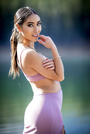
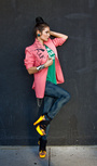
I posted a while back asking for a critique on my work and only got one reply...would love to get a little more feedback. Nov 04 17 04:46 pm Link Well at least you got a thoughtful reply. You've experimented a lot with lighting, posing, and composition, and I think you've reached a stage where it's just a matter of taste. If you are working towards making a living living at it, now it's time to find out what your local customers like and are willing to pay money for. If you are just doing it for the fun of it, relax and enjoy it. Nov 06 17 12:51 am Link You have quite a mixed portfolio. Several really great images and some which I wonder why they are part of the same portfolio. I will first comment on what I think are your best images: There is lots to love about this image. It has a lovely setting and tones and the light is very good. However, I think it could be much stronger. Her face gives the viewer very little expression because it is in profile so we rely on body language. I *think* she is supposed to be so very absorbed in the moment yet her right arm/hand seem too posed for that to be the case. The second issue is attention to small details. I don't find the positioning of her legs and the effect that it has on the dress to be flattering...it seems awkward/strange right around the knees/upper calves especially with whatever background object is behind her there with such a bright highlight. She is in the middle of a forest, but is holding what appears to me to be a flower which is too perfect for such a natural/wild setting. So, I feel I am looking at a lovely image of a woman which is too posed to be a "natural/casual" portrait and in a lovely dress which is too ill regarded to be a fashion shot. I don't know what this image is about...it has many lovely elements (setting, wardrobe, model, makeup, light, composition) but I can't relate to it emotionally.  This one is lovely. Great lighting for a beautiful model with excellent hair and makeup. Eyes look really great and bright and skin looks very soft and warm. The colours on the wall add to the warmth and softness of the mood. There are just a couple of things I think would make this stronger: 1) The jewelry. I find the watch and necklace to be a distraction. The necklace is catching some lovely light, but that makes it more prominent than it should be. Similarly, the watch looks big on her wrist and compositionally you don't want anything at the top of the frame to draw the viewer's attention above her face. 2) The pose works really well for all of the image except for her right breast and hand...this area seems very squished with the wardrobe, necklace, arm/hand, and breast all pushed together. Better to have her pull her right shoulder away from the wall slightly to give better lines and space to this area.  This image is really great. Probably your best. Great model, good wardrobe, wonderful setting and composition (except for cutting off her feet). Good expression on the model and great angle for her face. Only minor suggestions I have here are: 1) Pay close attention to how her leaning back affects the flow/draping of the dress at her hips 2) Watch for the pucker of skin under the models arm. If she moves her left arm towards the camera and/or raises her left elbow this can be avoided 3) Reflect some more light onto her legs so that the skin tones better match her arms and/or smooth out the tones in post. 4) Turning her torso/shoulders slightly towards the camera would help with the skin pucker and provide a view of her neck, upper chest, and the line of the dress bodice.  Lovely light. I wish the background and the dress were slightly less blown out in terms of exposure and perhaps a slightly different pose in terms of her left arm so as not to block off the front of the dress and her upper body shape.  This one is good too, but given the glamour/boudoir look to the rest of your portfolio this one seems much more fashion oriented and a bit of a misfit from that perspective. Small details like her nails (very short and round) and the glare from the watch face are very minor things that could be improved.  Absolutely wonderful background blur and colour. I wish the skin was not quite so blown out on her back and strays remove/absent from the left side of her face. Lovely tone and texture of the skin on her shoulder/arm. The facial skin is good, but seems just a little less natural compared with the shoulder/arm.  Okay, that's enough nit picking on the really great stuff. Here are some I think you should remove from your portfolio to make it stronger: I like the natural setting, but the light is very flat...raining? I am not a fan of the pose (especially the over extension of the left elbow), the chin tucked in preventing view of her neck, left shoulder directly pointing at the camera, left hand fingers looking very claw-like, and dirty feet with curled, cut off toes. I think there are much more flattering poses to work into this setting and you have much better in your portfolio.  Nothing "wrong" with this image, but it seems very out of place in your portfolio and you have another similar one in colour which is a better image of the subject and more consistent with your style. This shows some range/variety, but seems out of place to me and distracts from you having a consistent style.  This is another shot where I am just not sure what it is. It seems a cross of fitness, swimsuit, portrait altogether. To me the pose (particularly the arms and hand on chin) just doesn't suit the other elements and confuses me as to what this image is.  I hope that's helpful. You have lovely work and I really am picking at small issues here assuming that's what you were after in requesting a serious critique. Nov 06 17 09:05 am Link |