|
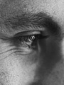
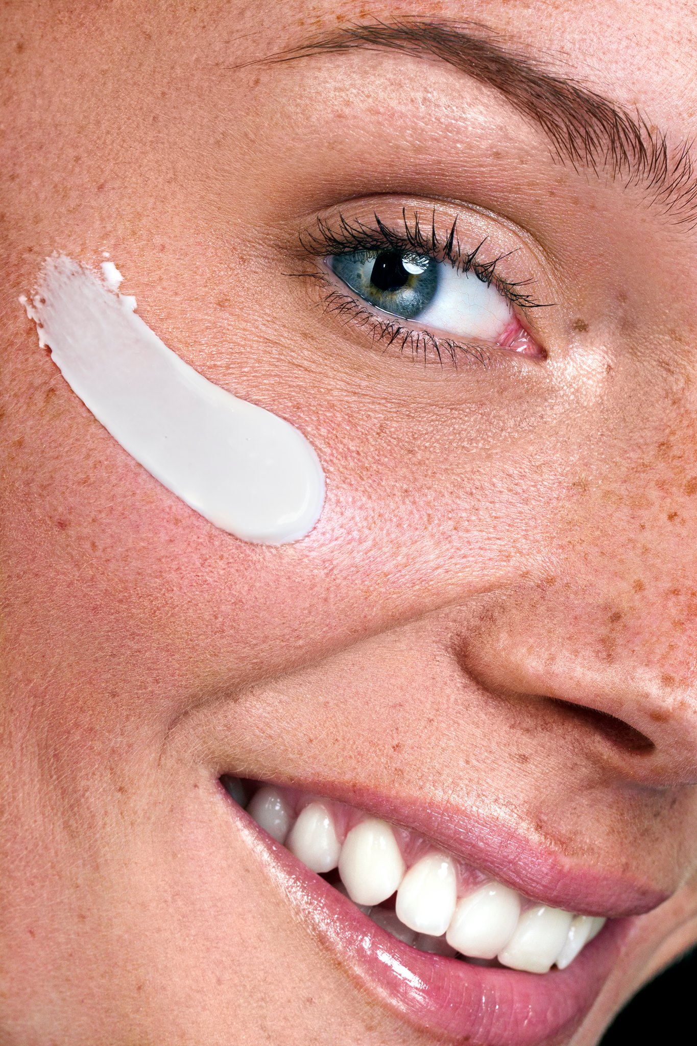
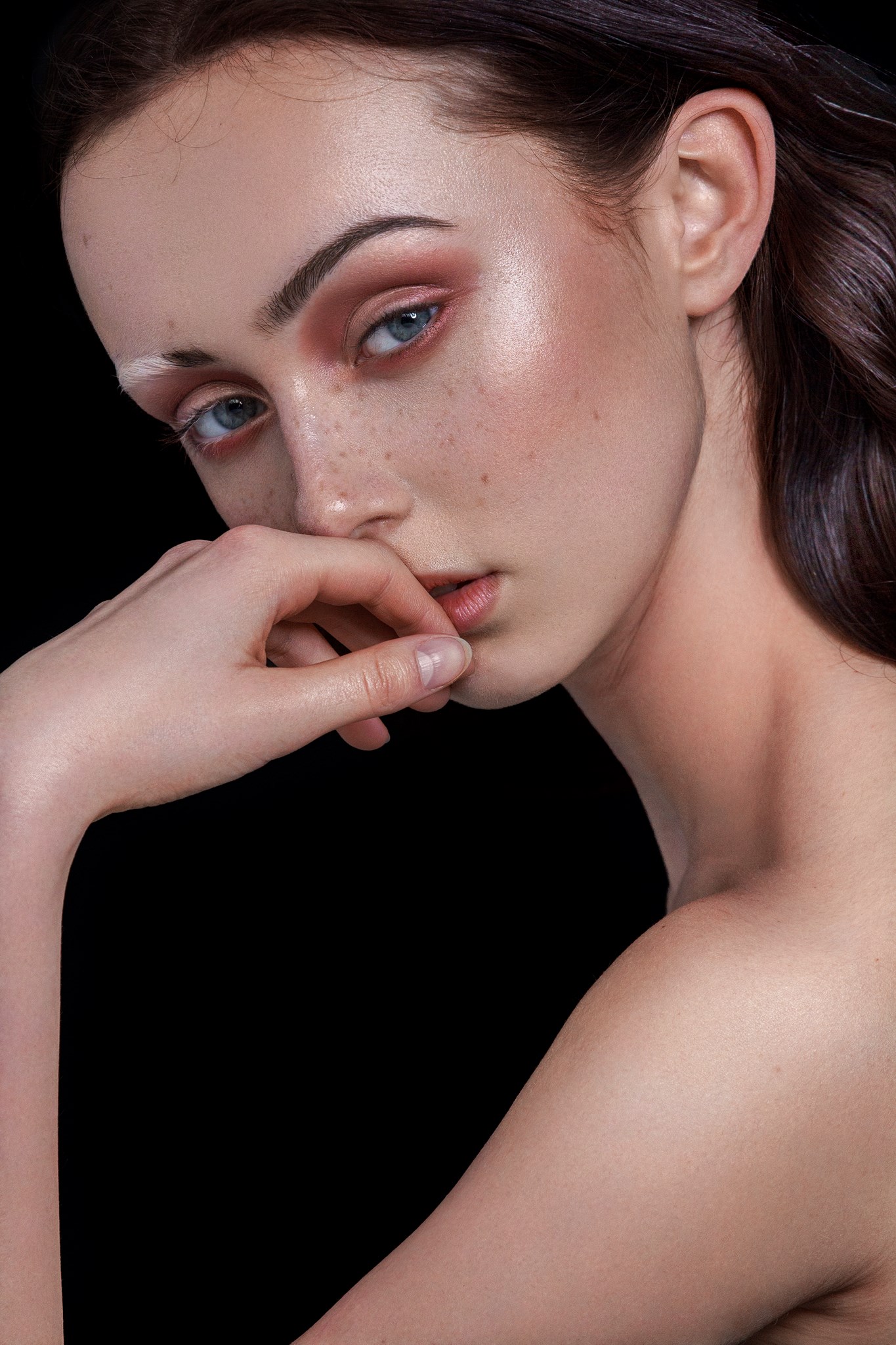
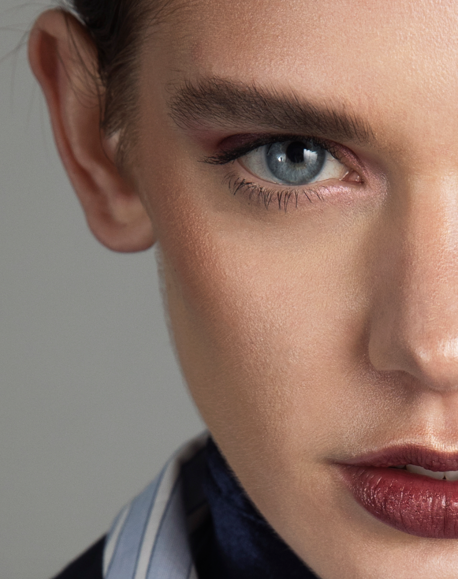
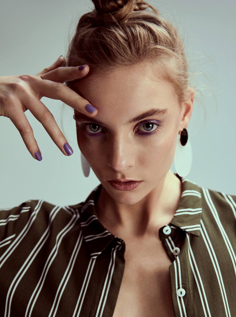
Hi, I'm working on my website and I always struggle on what to keep and what to ditch. I always believe that less is more, and that I'd better show some good pictures instead of a lot of them. Can you perhaps check the portfolio on my website www.lotteconcepts.nl and tell me what to ditch and why? May 01 18 04:27 am Link Your work is very strong. I'd suggest - Ditch the long shots, except for those that show work for significant publications or clients - and only one per client, and only when a closer shot isn't available. - When two shots are similar or serve the same purpose, ditch the weaker. Eg the shots with the dropper and the white smear of goo, the three lipstick shots should all be culled to one shot for each group - Aim for around 16 images, just like agencies do with a model's port. Maybe go for a 2x2 layout at the top for your 4 strongest images. Perhaps - http://lotteconcepts.nl/wp-content/uplo … zinga2.jpg http://lotteconcepts.nl/wp-content/uplo … 2274_o.jpg http://lotteconcepts.nl/wp-content/uplo … .22-PM.png http://lotteconcepts.nl/wp-content/uplo … 8985_o.jpg May 01 18 04:52 am Link thank you for the clear feedback! May 01 18 09:58 am Link LotteConcepts wrote: Your work is a complete pleasure to look at - it really was no effort at all! May 02 18 05:53 am Link unless you have a specific reason for these two images that I am missing I would delete these: http://lotteconcepts.nl/wp-content/uplo … 2274_o.jpg the white on the right eyebrow is really competing for attention distracting the viewer from focusing all attention on the left eye, arms aren't normally perfectly straight so the edit on the inside line of the arm seems unnatural. not a fan of crops that completely cut a limb so if there is more in the bottom and you can crop it and leave it connected it might display better. http://lotteconcepts.nl/wp-content/uplo … 6664_o.jpg instead of coming off as dramatic the shadows on the face seem to be more of a distraction the see through green overlay seems hokey. these two images don't seem to reflect the quality and talent of the rest of your work. everything else looks terrific. hope this is helpful. d May 11 18 06:06 pm Link Overall I like your images and i think they refliect well on the work that you do - which is at a high level I do think though that you too many lip / lipstick photos ( I would keep the first one and maybe one or 2 others ) and that you could balance those photos with some eye/ eyeshadow shots It appears from your bio and your work - that you are totally focused on Beauty Makeup ( which is good ) so I wont ask about any other types of makeup ( ie creative fashion or wedding ) May 11 18 09:09 pm Link Garry k wrote: Thanks for the feedback, was wondering about those. The lips are simple selfies, some colleagues "know me" for the lip selfies, but the quality of those isn't that great compared to the rest May 12 18 03:56 am Link |


 will delete some