|
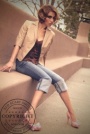
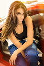
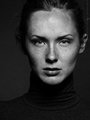
Hi MMers! I'm finally in a location where it's easy to set up shoots so im updating my portfolio. Had a fun shoot with a local photag recently and I've posted three images from it in my portfolio. The first three images. Particularly wanting feedback on the nude bc I haven't shot many of those before. Thoughts? Helpful suggestions? Thanks in advance! May 20 18 08:22 pm Link You are showing a diverse range of previous work. As you update your portfolio with newer work, I would start thinning out your much older work. Ten-year-old work is pushing the limit, although I do understand the lure of keeping such fine photographs from that time period. Regarding the black and white nude, it appears to be fine. It's not outstanding, but not bad. From a modeling standpoint, I find the bottoms of your feet to be a distraction. I would have asked you to pull your hand away so the viewer doesn't see it at all or show more of your hand on your back or side. It might not have been an aspect of the concept, but I would have asked that your hair be managed in some way or hired a hair stylist. I have other critiques about the photo, but they have more to do with the photographer's choices and less about yours as the model. Overall, not a horrible figure study. Keep at it. May 25 18 10:15 pm Link As a photographer I can only base my opinions on what I see, and how or what I might do differently.  Over all your expression is not very powerful. Hair seems a bit messy. Not crazy about the ball thingy shadow above your head. My preference would be not to have a gap between models right shoulder and left photo border, camera seems level with your neck would like to see it level with your eyes. Logos on photos are somewhat distracting, like adding another subject.  Not a fan of the added border, especially with it running through your feet. 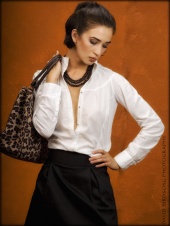 For me this is one of your strongest images in your portfolio. I wish you well May 27 18 03:39 pm Link I have to agree with Lee Photography here. As per the Nude, it's a good start. I would HIGHLY recommend that if you want to shoot art nudes or fine art that you fine a photographer who has some experience shooting that and has images that you really like. "Testing" in art nude can leave you open to having images out on the internet that you don't want people to see. M Jul 13 18 06:14 am Link Of the 3 images I think the nude is the strongest. The first has lots of issues, but the biggest for me is the facial lighting. Tightly framed photos like this should take care to light the face in a flattering manner and I think this one is lacking in this respect. The second image looks like a shapshot to me. I don't understand how the wardrobe, setting, lighting, etc. are supposed to fit together into a coherent and aesthetically pleasing/interesting image. For the third image I find that the high contrast lighting at least seems to work well with the environment to create an image which seems to me to be much more coherent. I hope that's helpful. Jul 18 18 12:35 pm Link |