|
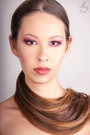
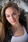
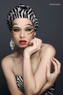
I've added 3 new photographs. Visit my portfolio and I'd like to hear your thoughts and suggestions. Sep 01 18 05:30 pm Link Hi Mishelle, Some very nice work in there, but it's a very mixed bag. Those three new shots are good, but semi-redundant. Slightly different wardrobe but the same hair and makeup. As you build your portfolio, try to lose some of the redundancies.   Too similar. As you build, keep one. The one on the left is more interesting, IMO. Beautiful shot! (At first glance at the thumbnail I thought that wrap around your neck was a scarf and I thought, "That's nice." When I realized it was your own hair... "AWESOME!")  Very nice headshot. A keeper.  The pose is too contrived. Might have been a bit more interesting if you hadn't been looking right at the camera, but this one could go.  Stiff pose, the hair's a bit of a mess, the head position is off, lighting and makeup are very unflattering to your face and the expression is kinda flat. You should lose this one.  Little you against a big busy background. You're just standing there. It's an ordinary snapshot and should definitely go.  Little you in a big scene, but it semi-works. Not an awful lot of detail in the dress, but you look good. I just wish the shot was a bit tighter on you. A keeper for now. Sep 02 18 08:17 am Link You possess a great beauty .......but to be honest .... after seeing your avatar ( which is a strong photo *) I was expecting to see a developed fashion and beauty portfolio You need to find a way to work with better photographers * however there is a slight colour/ hue imbalance between the makeup on your face and your neck and shoulders . A good makeup artist will blend the facial makeup into the neck or may even apply makeup to the neck and shoulders to correct such an imbalance Harder though for a photographer or retoucher to correct the imbalance in post Sep 04 18 09:45 pm Link I guess she didn't get the feedback she wanted.  Sep 11 18 07:43 pm Link Thank you all! I appreciate the feedbacks  Sep 29 18 01:28 pm Link Tbh, every time I’ve come across your portfolio over the past several years, my first thought has been that I’d love to work with you someday. That’s the main reason why I’m adding to a thread that’s been inactive for almost four months. You have a killer look, imo, but I don’t believe your portfolio accurately represents your ability and potential. Models who are much better than their portfolios are something that I constantly look for in model portfolios. Based on your portfolio, beauty work is your forte. Beauty work requires a certain type of facial/bone structure as well as good clear skin. However, beauty doesn’t require a lot of “modeling skills” i.e., posing and expressive skills. You also have good collar bones, which isn’t a requirement for beauty work, but it’s a plus in almost any genre – especially fashion and beauty. By beauty photos, I’m referring specifically to these two photos:  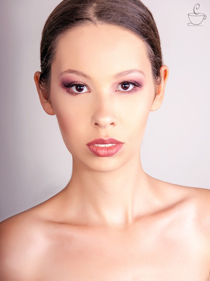 These photos are very close to being topnotch high-end beauty photos – but they aren’t. The main reasons why they aren’t are the lighting and the retouching and, to some extent, the makeup. None of these things is horrible. But they aren’t as good as they could be, either. Beauty products companies want hard, directional lighting (without deep shadows) and perfect skin. What we have in both photos is soft lighting – so soft that there is no nose shadow at all. Without a nose shadow, the only ways to figure out the lighting is to look for the catchlights in the eyes and the patterns of the highlights. The photographer used three lights, two to your left (camera right) and one to your right (camera left), all at approximately the same height. The lights apparently were slightly above your eye level and not very far from you (horizontally, e.g., left or right). That is not the formula for hard directional lighting. Although all three lights apparently were “hard” (and probably with identical or nearly identical round modifiers), but because of the placement the three lights, the overall effect is flat, not directional. Also, there are specular (somewhat blown-out) highlights on the left (camera right side) of your face. Blown-out highlights, unless they are small, are not good in most genres of photography – and blown-out highlights of any size are cardinal sins in beauty photography. These specular highlights could have been fixed by applying a little powder to the left side of your face, by powering down the two lights on the right side of your face or adding diffusion to those lights or by feathering the lights (either of which would have made the overall effect even more flat) or, as a last resort, in Photoshop. The other thing, in the top photo, is that your hair hasn’t been retouched to beauty quality standards. At the very least, the cross hairs (those going against the grain of the main flow of your hair) should have been retouched out. With a high-end retouch, the hair would look more like the hair in this photo (from the portfolio of a retoucher friend of mine whom I highly recommend) – without adding additional hair.  Other than the blown-out highlights (which could have been fixed by the MUA or the photographer, the makeup is very good. Apart from the large specular highlights, the transitions in the tonality of your skin (especially on the right side of your face, at camera left) are pretty smooth. Even with high-end makeup, the transitions in skin tone are rarely that smooth – until the photo has been professionally retouched (which these haven’t been). Also, in retouching, the part of your hair would have been straightened, and your lip gloss would look more glossy. I’m not the world’s greatest retoucher by a long shot. But if those were my photos, I would have sent them to a high-end retoucher (I’ve worked with several of them) and paid for a premium retouch – and the photos would look totally different. The question is whether you can do other genres equally well. I may be wrong, but I believe you can. (With models whose portfolios I believe fall short of showing what they are really capable of, I’ve been right, a lot more often than I’ve been wrong.) It’s not that any of your photos are horrible. I’m not a fan of the graffiti photo. Because of your size relative to the background, it’s almost like you’re an innocent bystander, rather than the subject of the photo. With the others as well, when I look at the reasons why they fall short, it always seems to be because of the photographer rather than you. That’s one reason why I’m certain that your portfolio could be much better than it is – without your having done anything different. 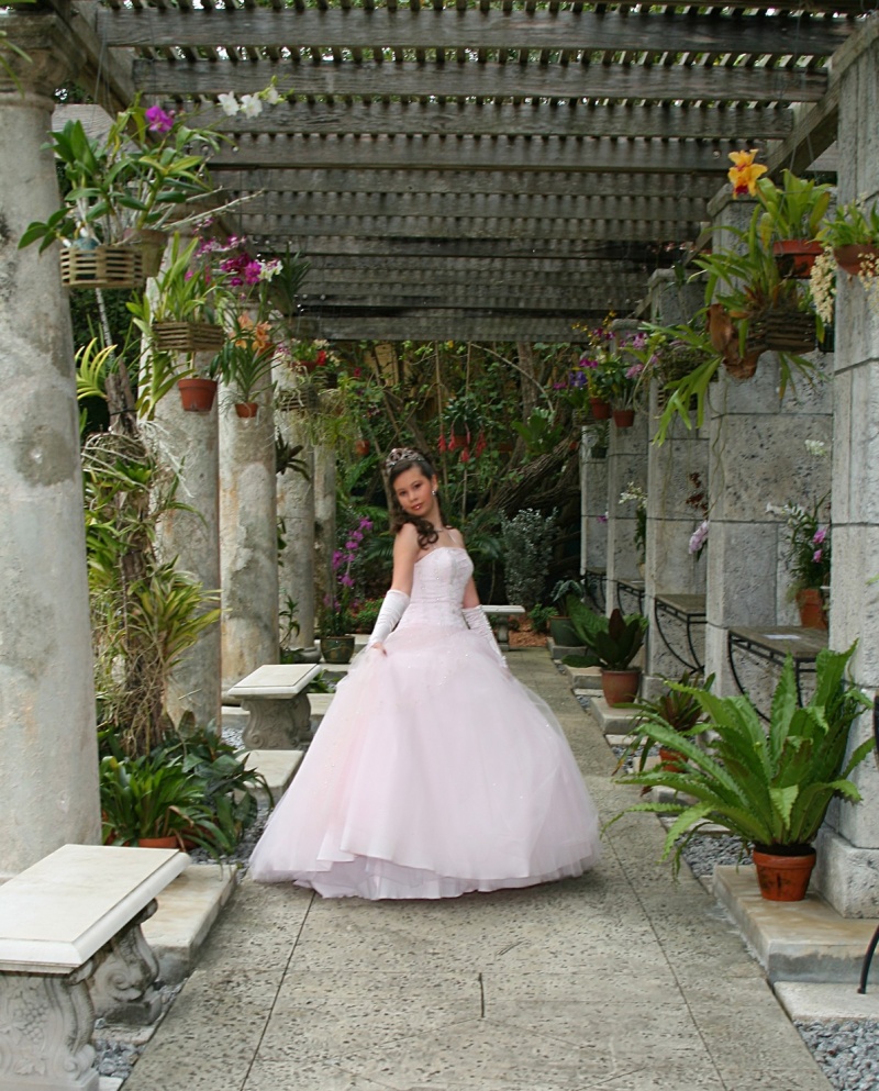 With the above photo, I would have had you make one change in the pose – moving your arms out from your body. Having your hands against the sides of the body makes your shape, from top to bottom, look straight, rather than feminine with curves. It also makes you look wider, adding several pounds to your (apparent) weight. The effect is even worse if the arms match the same torso (with a long-sleeve garment, for example. Because you were under a roof or a canopy of sorts, the lighting is very flat. This makes the photo overall look flat. Also, your face looks darker (which means that the eye is going to look elsewhere). When looking at a photo, the eye is drawn to the lightest area of the photo, the brightest colors or the area with the greatest contrast. None of those is you. The benches at the left and rear are the brightest areas in the photo. The eye begins at the first bench on the left and goes from there to either the second bench or up the first column. If it goes to the second bench, it goes up the second column, across the top of the photo, then down the right side to the green plant at the lower right corner – where it stops, because there is nothing to lead the eye elsewhere. The entire setting is busy, and everything is pulling the eye away from you. Your face is the darkest area of the photo besides the background. That does not draw the eye to your face. That could have been fixed by having a strobe or speedlight to your left (camera right). Of course, the light source would have had to be in the frame, and that isn’t good. The way to fix that would have been to shoot a photo of the set (without you or the flash in the photo) with the camera on a tripod. The light would then be masked out of the photo with you in them. With the camera on a tripod, everything would have lined up perfectly in the background photo and the photos with you in them. Even easier than that would be to have you facing camera left. The light could be concealed by the columns at the left of the veranda, with the flash coming in between the columns. Since that’s the direction where the light is logically coming from, that would have looked perfectly natural (while having the light coming from camera right would not). Since the left side of your face is the feminine side, you should look better when facing right anyway. The other photos are generally flat (very low in contrast) as well. With rare (and usually carefully planned) exceptions, it’s very difficult to make colors pop or produce a photo that stands out and grabs a viewer’s attention at all with very flat lighting. There is an additional problem with the photos with very dark backgrounds. 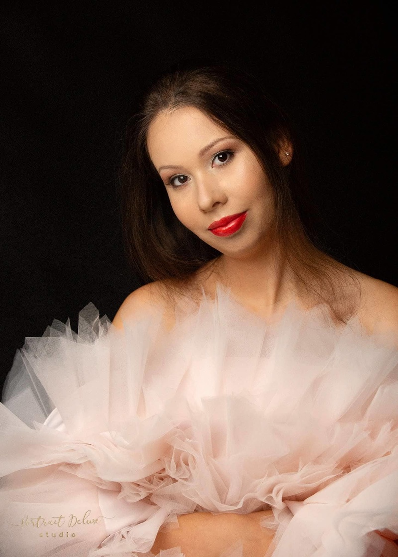 Your hair merges into the background. In some places, it’s impossible to tell where you end and the background begins. The way to fix this is with strip lights at the sides and somewhat behind you (aka side lights, kickers or in some cases hair lights) – something like this: 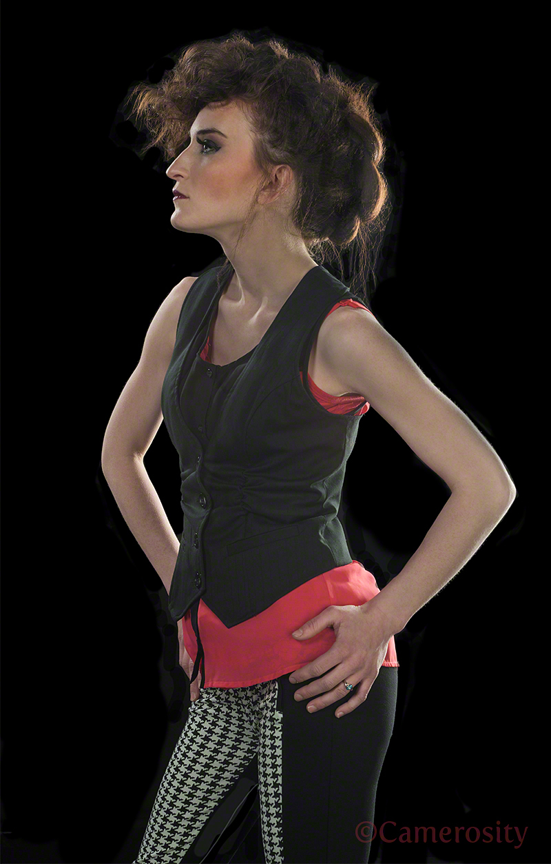 Regarding the butterfly photo, the cropping of your arms is awkward. Either most or all of the arms (nearly to or preferably below the elbows) should be shown, or the photo should have been cropped just below your hands.  Because the butterfly is so small, I’d vote for a tight crop just below the hands to make the butterfly bigger and more prominent. If the butterfly were more colorful, I’d have the black background behind the butterfly. With good lighting, a colorful butterfly would show up much better against the black background than against your skin, which isn’t that much different in luminosity than the gray butterfly. In fact, I’m not at all sure that it’s a real butterfly… Jan 22 19 12:42 am Link Hi Mishelle, Photo tones are off and images too photoshop looking plastic. Any logo outside of a cover title for a website or magazine without your name will always hurt and suggest the model is not important. Elvis, Marilyn and Sinatra didn't have suc logos or others name and neither should you for your port. Very pretty model yet expressions that are similar are not friendly expression. Gorgeous hair. A few other tips in first image hand is out to camera and on neck. Picture is all forearms and arms and over photoshopped and don't put arms around neck and plastic is not real. You want images that keep you looking real and shot for features, not bent wrists arms and forearms. Portraits with hands near neck or face are very ineffective. Always ask what the purpose of the image is. If a portrait, what purpose is hands near face or neck when body language skills are done with body for you want every image with purpose for who knows how many pics a viewer and potential client will look at. You look more polished and professional when the viewer knows exactly what the image. Never use tiny images and always use images in standard ratios so they look natural . Tiny images are not only not professional but hurt chances of finding work for all true worthy clients know the purpose of an image is to showcase your abilities and small images say the person with tiny image is very inexperience. All that said you have nice healthy hair and very attractive so you just need to find an experienced professional to shoot your port without the logos and over photoshopping. You look like a great magazine and agency model. have fun! May 30 19 07:01 am Link |