|
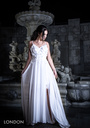
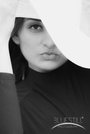
I know my port and page are less than optimum so I'm looking for objective critique to point me in the direction needed to improve it. Thanks Nov 20 18 09:32 am Link It seems like most of your portfolio was uploaded in 2012... Any photos since then???? B Dec 07 18 02:46 am Link 1) https://www.pinterest.com/pin/647603621395029511/ This photo has a very heavy post-production feel to it. I would guess that you: - Darkened the bricks around the model - Brightened up her face in either Lightroom or Photoshop. Unfortunately, this leaves a noticeable 'bad editing' look. Usually newer photographers try to overcompensate for bad photography with over-editing. The best thing you can do to counter this is to take a photo that, in the first place, is nearly perfect in-camera, and needs only minor editing. How? Study light. Take courses on light, and photography lighting. If using natural light, learn to use it to your advantage. The last thing you want to be doing is trying to adjust the lighting in post-production to correct for bad lighting in-camera. 2) https://www.modelmayhem.com/portfolio/pic/42824363 I know you're trying to use depth of field creatively here, but the fountain water simply blocks your subject, rather than framing your subject nicely. 3) https://www.modelmayhem.com/portfolio/pic/42824365 This photo does not make your subject look attractive... quite the opposite. If photographing someone who is not your typical agency stats model, you want to bring out their best features and minimize anything that is not. 4) https://www.modelmayhem.com/portfolio/pic/29167869 Really bad lighting... don't shoot in direct sunlight during near-noon day unless you really know what you're doing, otherwise you'll get hard shadows around your subject's eyes, and hard shadows on their face in general.... not a good look. 5) https://www.modelmayhem.com/portfolio/pic/29167879 This model is more attractive than most in your port... you should shoot with more models like her as you build a better port. 6) https://www.modelmayhem.com/portfolio/pic/42824357 When doing headshots, even for men, some skilled photoshop is needed. And, I don't think a green background like the one here is doing anyone any favors. 7) For many of the other photos, I feel that the face has a 'blurred' photoshopped look. For instance all these instantly look that way to me, even from their thumbnails: https://www.modelmayhem.com/portfolio/pic/42824361 https://www.modelmayhem.com/portfolio/pic/42824359 https://www.modelmayhem.com/portfolio/pic/42824362 https://www.modelmayhem.com/portfolio/pic/42824353 Dec 22 18 10:02 pm Link KiMomi, As a fellow photographer it is typically hard to critique someone else port without sounding like I am throwing "shade". However your portfolio consist of some serious violations that are worthy of shade. Not so much your work, just the way you have your portfolio structured. I will start with get rid of this:  It does not benefit you or the model. Also lose all the doubles you have from each shoot. Choose a single photo to represent the session unless there are multiple themes or outfits with the same model. Q/Q= Quality over Quantity should be your rule of thumb. Not sure what you were going for with this shot but it does not come across well all: 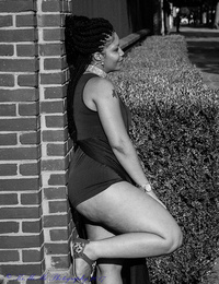 Here is another one that just doesn't belong in your modeling port because the concept is totally lost and leaves the viewer with a WTF momemnt: 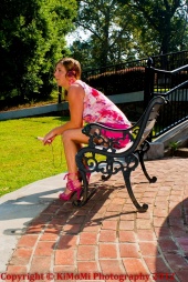 looking at your port indepth, you seem to have a lot of oddities that really stand out and is therefore hurting your port enough to say it is very strange: 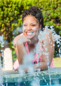 Bluestill Dec 25 18 07:52 pm Link Some basics: You can see you have a good working relationship with models Keep logos off the image. they distract from the look, Especially script. Like hands they ruin the work. Models need eye shadow and full eyebrows. Let your models know in advance Real models don't wear bras or undergarments , they ruin an image, brake up lines, break up tummy lines, create wrinkles, no human curves, more wrinkles, add colors. Just not done by pros. You have alot of arms, hands and shoulders destroying the shots, bent wrists all basic do not dos you want to avoid. Way too much photoshopping looking plastic, too much headroom in some and bad cropping https://www.modelmayhem.com/portfolio/pic/30635500 keep hands and arms away from neck and you don't want that super dark shadow under neck to be so strong Hand under chin shots just creating problems https://www.modelmayhem.com/portfolio/pic/29167869 Shot of an outstretch arm, shoulder and wrinkle with logo and panty lines Bad lean too Next shot of her the fence is so distracting and at neck level breaking up any lines and then you have the sharp edge of the barn close by https://www.modelmayhem.com/portfolio/pic/29167746 tugs done right are sexy, done wrong trashy for this is pulling, and adding stress for the other edge is above bum and as you tug the bottoms need to how the hip, not material and distractions. Model should wear the black bra or bikini top or white top. Pros never wear both unless they are shooting for a client. Logo huge distraction and messy. fence at her neck level also adding a real bad look as does the pole. The toes are cut off but all that extra head room. If bottom or top is tight then make the bottom edge tight too, Model shoulder is up https://www.modelmayhem.com/portfolio/pic/42824366 over photoshop of pretty model, bra and belly button rings are one of the worst things a model and photographer can have in image. Not a good look ever, even for gothic and pierced models. Hand and fingers huge distraction and you never want the back lof the hand to camera for glamour. Don't cut off her privates for it de-humanizers her especially with all that extra room at top. Hand holding down top at angle not good. Elbow away from camera is good. Finger above head very distracting https://www.modelmayhem.com/portfolio/pic/42824365 Very bad posture and this is where you photoshop the leg. Model looks tired and like resting versus posing for your shot. That arm doesn't make for a feature. You want to shoot features. earrings totally fighting with the head chopping thick necklace. Extra headroom but toes chopped off. Board looks like its going thru head. Camera shooting by itself is ok, you just need to be aware that everything matters and that goes for makeup and then pick a good spot for shot without distraction. No multi layers, arms under chins, shoulders knees no good, shoulders down. Poe the hair. All fixable on your next shoot! have fun May 30 19 12:03 pm Link |