|
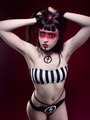
Hi I posted a few more photos and would love your thoughts on them.I will return the favor  Jul 19 20 07:58 pm Link Overall, your work is showing potential, but you have a lot of learning yet to do. First, do some research on posing your subjects. There is a lot of experimenting in your work, which is good, but also try more traditional portrait poses. 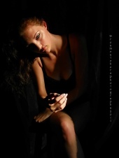 For example, this photo has some issues. In most cases you don't want arms or legs pointed towards the camera. That foreshortens those features. With her hand closer to the camera than her face, it enlarges the hand size compared to her face. Usually you don't want to show the back or the front of the hand, but rather the side of the hand. This elongates the hand and makes the hand appear more graceful. Also, the shadowing of her hand on her lap gives the impression that she is missing fingers. Working with non-professional models can be difficult, but this is the job of the photographer...to educated the subject on posing. 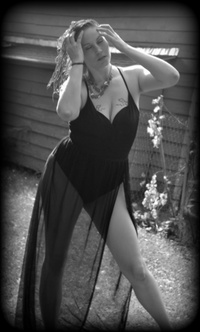 The usage of such a hard vignette is rather dated. I'll use the technique, but much more subtly. The idea is to use the vignette to subtly darken the background in order to bring emphasis to your subject. There are a few examples of this technique in your portfolio. Try using it in a less extreme manner. Again, with posing, this photo also has some issues. Her knees should be slightly bent. Usually joints are more attractive if they are slightly bent.  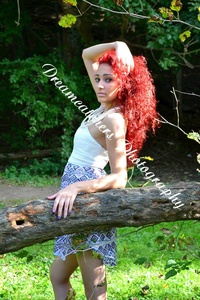 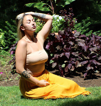 A lot of your work uses natural lighting. Nothing particularly wrong with this, but you need to recognize when the lighting is too strong and creates unappealing shadows. For example, in the first and third photos, you have sun light directly overhead. This creates long cast shadows of the facial features of the subject. With the aid of an assistant, I would have used a diffuser above the subject to soften the sun light. In the second photo, I would have used a reflector (or white board) onto the model's face. This way you would still get the hard sun light on her hair, but would also lighten her face, instead of keeping it in shadow. 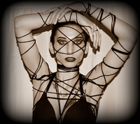  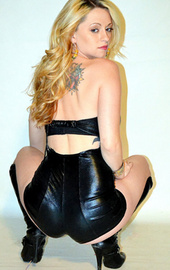 Rarely, if ever, use an on-camera flash to light your subjects. In all three of these photos, you are getting a harsh background shadow on your subject. Experiment with studio lights or with modifiers on a less expensive, off-camera speed light. There is some creative experimentation going on your work, keep it up. But there appears to be some fundamentals that need to be worked on as well. Good luck. Jul 29 20 02:33 pm Link I agree with the previous critique. I'd add that your watermark, like your vignettes, can be outrageous; that's not good. Your picture size is not consistent and could be improved. This is your very first post. I hope you come back to the forums often. Aug 03 20 04:44 pm Link  The armpit is dominant in this shot and is as large as the subjects head. Also the straight line from her breasts to her neck is akward makes her neck look broken. Reposition her arm and have her bring her neck forward. 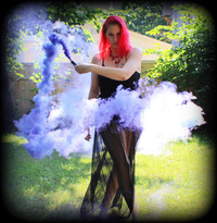 Watch for distracting background elements such as the houses gutter which cuts through your model. This image could have a fantasy feel but it instead looks like it was shot in someone's back yard. This can be avoided by shooting at a wider aperture to blur the background or be more selective about the elements in the photo. 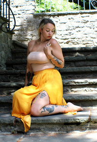 This pose is really unflattering to the model and her foot is the brightest part of her. Extend the models left arm so it is not folded against her body akwardly and extend her leg/s to make her appear longer. 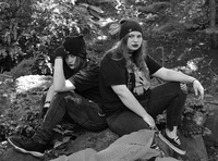 The black and white conversion combined with black clothes causes the subjects to blend into the background. Perhaps play with the black and white conversion settings to create some contrast between the clothing and the background.  This file is too low resolution for a portfolio shot IMHO. 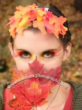 She is looking up through her eyebrows. Have her tip her head up slightly so that the iris is more centered in the eye. The arms are squished and the hands are close to each other with the backs facing the camera. This becomes the focal point of the image. Have her bring her elbows apart under her shoulders and lift her head up. General feedback: Select only the best image from the same look/location rather than having multiple similar images. Large watermarks plastered over the center of the image does not give it a professional look and is quite distracting. Nov 19 20 09:05 pm Link |