|
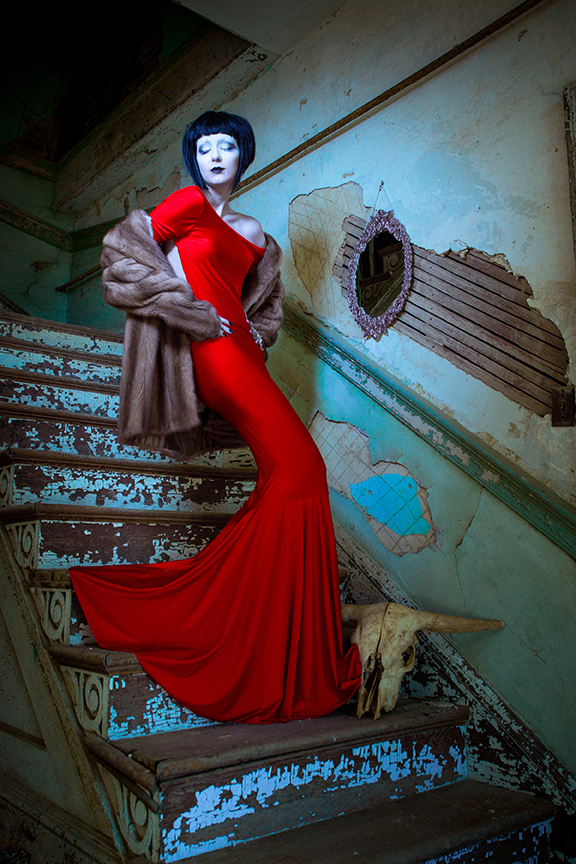
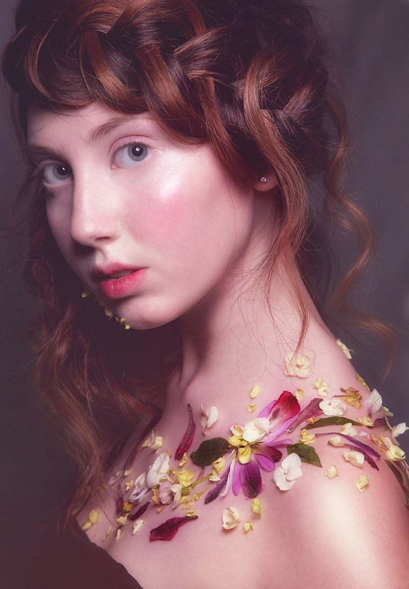
Would anyone be willing to do this for me here? It will help me grow. Aug 24 20 03:29 pm Link I like your entire portfolio in general. Each image expresses something different. I've never been able to create something soft and high key like this so I'm going to choose it as my favorite.  Not a lot of detail, just quiet beauty, Attention on her lips and eyes. Lovely skin framed by her hair. Great light. One thing that I never care for is jarring black tape over nipples. It's too bad that you didn't have some pieces of jewelry to use instead of black tape in that other image. Aug 24 20 06:00 pm Link Mark Salo wrote: Thank you! I've updated my avatar based on this feedback! Mark Salo wrote: I can see that perspective. Aug 24 20 06:23 pm Link As a model, I love this one for several reasons. I particularly like the way she's presented here, the pose is nicely chosen, she is simply beautiful and the light and shadow are excellent. You have both done very well, and any model ought to want to show a similar pose in her own portfolio. I'd like to see the models credited.  Aug 25 20 05:57 am Link  This is you best executed picture. Lighting, styling, background work well together. Not sure about the cow skull, and her make up might be a bit excessive, kind of gothy, but maybe that's what you wanted. Nevertheless, the picture is flattering to the model. She looks pretty and long.  This is my second favorite. Lovely portrait. Flattering and interesting at the same time. Make up is not overdone. She has a fresh look. The rest of your work I have either styling issues, issues with your choice of certain colors, or simply differences in taste. You seem to be interested in fashion. Look at more fashion magazines if that's the look you are going for. See what makes a good fashion photo, the casting, the styling, lighting or lack thereof , etc. Aug 25 20 01:35 pm Link I like the second image as well ,,,I agree that it is lovely and flattering ( and probably a style of photography that could be quite successful for you ) but there are a couple problems with it in my opinion . The Flowers on the Models shoulder stand out to much and maybe decreasing their saturation a bit would help . I would also suggest editing out the small flowers around her chin as they are distracting Aug 25 20 10:23 pm Link Garry k wrote: Thank you for that feedback! I'll take those points into consideration.. Aug 26 20 10:59 am Link Aug 30 20 12:35 am Link you're creative with an obviously good eye and aesthetic sense, keep doing what you're doing! Sep 17 20 09:28 pm Link Your images make me want to take a closer look. I will leave the technical stuff to the experts.For my 2 cents I do think some of them are over styled and be mindful of your choices of accessories. Maybe because I'm in South Florida but lose the black heels with the swimsuit! Rick Oct 21 20 12:31 am Link |


