|
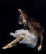
I'm a painter, not a photographer, but I did a quick maternity shoot recently (mainly intended as starting point for paintings), and I would appreciate some feedback on the photos. (as well as any tips for future shoots) Have a look: https://www.modelmayhem.com/portfolio/4196854/627573 (link instead of posting the images here as it appear posting images with nudity in them is not allowed in the forum, is that correct?) Feb 13 22 04:01 am Link any feedback appreciated Feb 22 22 03:08 am Link You are correct, you must link to photos with any exposure that would cause them to be "M" rated here on Model Mayhem. For many years I assisted a photographer who did a lot of maternity work, and yours is nicely posed. The lighting may be a bit too strong for some tastes, and we found that pregnant women wanted their faces clearly visible in most of their photos. But what you are showing is good for your needs if you can paint from them. Feb 22 22 07:15 pm Link The first 2 images had her face clearly visible, but the model didn't wanted to be posted recognizable hence why I cropped the first and darkened the 2nd photo. Thanks for the feedback. Feb 23 22 12:15 am Link That's understandable about editing out her face if she doesn't want identifiable naked photos of herself seen by the public. Most pregnant women who want such photos and artwork done are not models, but want to create images that they can keep forever as a special memento of that time in their lives. They will pose naked for a photographer or artist as part of the creative process, but only with the stipulation that their face can't be shown. You will find that some don't care if their face shows but they don't want you to show photos of their exposed body areas publicly. It's best for the photographer or artist to get a signed model release allowing them to display such photos so everyone is on the same page about it. Feb 23 22 06:38 am Link It is entirely a matter of personal preference, but I would prefer a bit more nuance in the tones. The shadows are far too complete for my taste. Apr 01 22 08:44 pm Link The photos look amazing tbh, don't see much, if anything, that should have been done differently. Apr 05 22 06:55 am Link I like the kneeling photo. It's well lit without being overexposed except at the far edge. Shadows create interest in this photo as light follows the model's form. This is easily your best of the group. The first and third didn't fare so well in my opinion. In the first, shadows make the model's hands look dirty. In both, highlights look blown and placed without intent. They're just bright blotches. Consider using the contrast to draw the eye and create interest. Be deliberate with your lighting. It's why the kneeling photo works! The last looks to me like a photo that came out too dark and simply got pushed in post to try to get some detail. I think this one is the least appealing of your shots. For your next shoot, check out tutorials on lighting for a chiaroscuro effect. You may also be interested in film noir setups. Apr 28 22 08:19 pm Link Rob Photosby wrote: Understandable, I must admit that part of the reason for that was to hide the ugly location I was shooting, as well as in some cases to obscure the model's face as she didn't want to be recognizable in the pictures. May 08 22 09:56 am Link PhotosbyChuck wrote: yeah, the kneeling one is also my favorite. I do like the 2nd one as well, but it looks better without the face cropped of (but the model didn't want to be recognizable), but I understand what you mean about the lighting. May 08 22 10:15 am Link ChrisStephens wrote: I always feel that if I have to explain, then I have failed. May 13 22 07:29 am Link |