Photographer
jandj studios
Posts: 3785
Las Vegas, Nevada, US
Shadowscape Studio wrote:
It's clean, simple and well lit. The tonal range is good.
Let me say something here before I continue further. I am not a stickler for rules of composition. I teach them in photo classes, but only because the students in my classes are beginners. They are learning how the cameras work, and hopefully I can get across to them some of the basic rules that help them create a better image. For those of us who know what the hell we are doing, the rules don't mean squat.
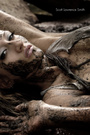
Now, back to yours. I don't like the composition of the image. The objects in there are fine, the models pose is wonderful. The arrangement of the model and the vertical cloth do not seem the best to me. It may be that she is not plumb with the vertical cloth, or appears not plumb because of the perspective. Whatever it is, it is giving me trouble The model is smack dab in the middle of the image. That bothered me a bit. I took it and cropped in on the left hand side to where the fabric is bunched on the floor, a bit off the top and bottom to bring the ratio back into play and found that with her a bit off to the left of center the composition looked very pleasing, to me.
It is a beautiful image, and I hope I have not said anything that pissed you off. it 's very scary sometimes. i was half way through typing a very very similar response. Including the bit about teaching and the so called rules etc. I don't teach anymore but when I did I taught the same rules for the same reason.
I immediately cropped the image to the left of center.
I might also have added just a tad more light to her face. I like the anomynity (sp)
of the face but want it to be a tad less featureless.
This was also my second choice and I would spend money on this shot and add it to my personal collection if my wife would let me. I'm not allowed to buy anymore art since retiring and movimg from a 40 acre farm with six out buildings to a three bedroom condo.
it is the hardest part of retiring.
Photographer
ArmageddonTThunderbird
Posts: 1633
Norwalk, Ohio, US
PHOTO dw wrote:
He he. I just got stomped like a narc at a biker rally. Not one friggin vote. 
That photo got a Daily Deviation over on deviantART and I was selling those for $125 at one point. So now I get to pose to the crew, what do you see in this photo and why would/wouldn't/didn't you vote for it?
https://modelmayhem.com/pic.php?pic_id= … id=5053267 OK, first things first: Before you deserve whining rights, you have to multiply that zero times the number of days this 18+ POTD thingie has been running. Cause that is how many votes I haven't garnered. (in my best Doug McKenzie voice) "Let's see, zero times what, two months? How many days is that? What did you do with Dad's beer, eh?" ... seriously if your image isn't what the dozen or so people looking want to see ... don't worry about it, eh?
And I suck more @ critique than I do at monitor calibration so iff'n you have bunions you probably ought to step back a bit:
The tonal range looks nice. We have apparently established that my highs are too low (monitor gamma) but it looks as if zone V is dominant and others carry detail. The camera right side of her breasts looks blown but I will grant you that which I asked.
While I want to leave the model out of this, the choice of model is an important element. Great choice of model - perfect figure, great skin. She makes me want to vote but I am known to be weak that way. ;-)
What I don't like: Generally I find the image confusing. The confusion carries through different levels.
Compositionally, it is almost symmetric. I generally lean toward strong asymmetry but have been know to 'split it down the middle'. This is none of the above, the hanging veil isn't strong enough to pull things back together.
The model's pose is also confusing to me:
Flat footed - not figure flattering, very low energy. Her figure can and does make up for the former but not the lack of energy.
There are very nice leading lines from hands up to face ... compositionally this is nice. But I find the overall effect to add to the confusion. Her hand placement (to my feelthy mind) implies ... uhm, self enjoyment? ... which then makes me question whether the head position/facial expression is a 'fine art' detachment cue or something else. Her right shoulder hints at the latter but facial expression doesn't carry that through.
PHOTO dw wrote:
I was actually going to enter the other one in my port from this session but since this one had no comments I was kind of curious as to how it would do. The other comes together much better IMHO. Without nit-picking amputated hand, right angle of right foot and such, the same flat footed pose/awesome figure fall into place with comfort in this one. She looks quite relaxed and happy to welcome us into her almost symmetrical frame.
I think that with a bit more attention to putting a bit more energy into both the pose and compostion both of these would be wonderful.

Photographer
SLE Photography
Posts: 68937
Orlando, Florida, US
PHOTO dw wrote:
That photo got a Daily Deviation over on deviantART and I was selling those for $125 at one point.
https://modelmayhem.com/pic.php?pic_id= … id=5053267 You're welcome, BTW. (I'm the one who nominated it for a DD & wrote an essay to the judges on why it deserved to win)
Lemme see if I can find what I said...
SLE Photography wrote:
It's simple, classic, and elegant. The wash of light & drape of fabric are perfect & crisp, the slight deliberate motion blur of the head adds just a touch of dissonant imperfection, and the positioning of the hands adds a naughty tease to an otherwise serenely innocent piece.
Photographer
SLE Photography
Posts: 68937
Orlando, Florida, US
As this is not my thread, I am going to politely ask there be no badmouthing of Chris Campbell's thread in this thread, nor anyone giving him grief about it.
Thank you.
Photographer
ArmageddonTThunderbird
Posts: 1633
Norwalk, Ohio, US
PHOTO dw wrote:
He he. I just got stomped like a narc at a biker rally. Not one friggin vote.
That photo got a Daily Deviation over on deviantART and I was selling those for $125 at one point. So now I get to pose to the crew, what do you see in this photo and why would/wouldn't/didn't you vote for it? I probably could have just said something like 'I didn't find the composition very compelling' - hope the additional info was taken in the vein in which it was offered.
SLE Photography wrote:
It's simple, classic, and elegant. The wash of light & drape of fabric are perfect & crisp, the slight deliberate motion blur of the head adds just a touch of dissonant imperfection, and the positioning of the hands adds a naughty tease to an otherwise serenely innocent piece. OK so maybe if I watch carefully I might be able to learn about critique here too. Spent over an hour agonizing over how to express - and this morning it looks overly harsh and wordy.

Photographer
Shadowscape Studio
Posts: 2512
MARCELL, Minnesota, US
SLE Photography wrote:
... the slight deliberate motion blur of the head adds just a touch of dissonant imperfection,... This is why we should not take any one critique to heart, good or bad.
James pointed out in his comments to DA how the blur was a plus, whereas I thought it was a distraction.
And, I am going to say it...the photographer needs to do what they think works, despite what others say. Critiques can be a tool for learning what others like and dislike, and it can be a useful tool when taken for what it is worth.
Photographer
Shadowscape Studio
Posts: 2512
MARCELL, Minnesota, US
Tommy Dee wrote:
Just got around to putting up my Friday entry. If anyone would like to dive into my latest 'not-art' ;-)
http://modelmayhem.com/pic.php?pid=5144670 18+ Her thumb is in a shadow and it looks like it has been chopped off in a work related accident.
Sorry, sorry, sorry! I just got up and have not had enough caffeine yet.
Time for someone else to tackle one of these.
I need to go put the tea kettle on.
Photographer
ArmageddonTThunderbird
Posts: 1633
Norwalk, Ohio, US
Shadowscape Studio wrote:
And, I am going to say it...the photographer needs to do what they think works, despite what others say. Critiques can be a tool for learning what others like and dislike, and it can be a useful tool when taken for what it is worth. Absolutely - and Dennis' request was "why you wouldn't/didn't vote" and I hope that is how my comments were received. I often do things that others dislike - intentionally, because I like them. And try to take that into account.
Shadowscape Studio wrote:
Her thumb is in a shadow and it looks like it has been chopped off in a work related accident.
Sorry, sorry, sorry! I just got up and have not had enough caffeine yet.
Time for someone else to tackle one of these.
I need to go put the tea kettle on. Leave it to you to notice the accidental amputation like a sore thumb. {G}
Don't be sorry! It's terrible that I hadn't noticed that. This was shot under extremely difficult conditions in a very cold old factory with an actively leaking roof. I worked hard at getting the light (from three hardware store clip-ons) to fall off in that very area using a reflector as a gobo.
Wondering now if I can bring her thumb out from behind the door opening a bit in PS.

Photographer
PHOTO dw
Posts: 159
Birmingham, Alabama, US
Tommy Dee wrote:
![https://www.blackflute.com/images/nic01010019s.jpg]() That is a super cute shot. I love it. Mainly because I am a guy. 
Photographer
Shadowscape Studio
Posts: 2512
MARCELL, Minnesota, US
Scott,
If you would like to be on the list of people who welcome comments as to why your images are voted on / or not voted on, let me know and I will add your name.
We are not allowed to discuss an image of someone else without their consent on this site. You will find the current list near the top of this page, and it will be posted somewhere on each following page throughout this thread for quick ref.
Glad to have you here.
Photographer
PHOTO dw
Posts: 159
Birmingham, Alabama, US
Tommy Dee wrote:
![https://modelmayhm-1.vo.llnwd.net/d1/photos/080102/22/477c5d111c708.jpg]()
Photographer: James Reneaux MM #415021 I can't even begin to define the reasons why I like this shot. This is one of those pictures that I just drop it and forget about technicals and rules and just enjoy the beauty. What a doll.
Photographer
PHOTO dw
Posts: 159
Birmingham, Alabama, US
Shadowscape Studio wrote:
Just finished calibrating my monitor.
I will have a go at your image Dennis.
When I brought your image up in the thread I was attracted to several things right away. It's clean, simple and well lit. The tonal range is good.
Let me say something here before I continue further. I am not a stickler for rules of composition. I teach them in photo classes, but only because the students in my classes are beginners. They are learning how the cameras work, and hopefully I can get across to them some of the basic rules that help them create a better image. For those of us who know what the hell we are doing, the rules don't mean squat.
Now, back to yours. I don't like the composition of the image. The objects in there are fine, the models pose is wonderful. The arrangement of the model and the vertical cloth do not seem the best to me. It may be that she is not plumb with the vertical cloth, or appears not plumb because of the perspective. But I think it is that the folds in the vertical cloth that head toward her butt need to continue to her rather than fade away. It would better bring my eyes to her hips and hands, which I see as the central focus point here. Whatever it is, it is giving me trouble The model is smack dab in the middle of the image. That bothered me a bit. I took it and cropped in on the left hand side to where the fabric is bunched on the floor, a bit off the top and bottom to bring the ratio back into play and found that with her a bit off to the left of center the composition looked very pleasing, to me.
I do like that space you have given her on the right hand side.
A tad bit soft on the forehead. This may have been due to the lighting or movement and not your editing, I don't know.
If it helps, your image was one of the final two that I was going over tonight.
I will not comment on the other one as that photographer has not been added to our list yet.
It is a beautiful image, and I hope I have not said anything that pissed you off.
And remember, this is my view of the image. I will not argue someone else's point of view. We each have our reasons, and yours may be totally different than mine.
I would like to see someone else have a go at this one. No, nothing said here has pissed me off. I am going to revisit this image with your suggestions and just see what I think.
Photographer
Shadowscape Studio
Posts: 2512
MARCELL, Minnesota, US
PHOTO dw wrote:
That is a super cute shot. I love it. Mainly because I am a guy. The American male does not mature until he has exhausted all other possibilities,
and I'm not done exploring possibilities.
Photographer
PHOTO dw
Posts: 159
Birmingham, Alabama, US
Tommy Dee wrote:
PHOTO dw wrote:
He he. I just got stomped like a narc at a biker rally. Not one friggin vote.
That photo got a Daily Deviation over on deviantART and I was selling those for $125 at one point. So now I get to pose to the crew, what do you see in this photo and why would/wouldn't/didn't you vote for it?
https://modelmayhem.com/pic.php?pic_id= … id=5053267 OK, first things first: Before you deserve whining rights, you have to multiply that zero times the number of days this 18+ POTD thingie has been running. Cause that is how many votes I haven't garnered. (in my best Doug McKenzie voice) "Let's see, zero times what, two months? How many days is that? What did you do with Dad's beer, eh?" ... seriously if your image isn't what the dozen or so people looking want to see ... don't worry about it, eh?
And I suck more @ critique than I do at monitor calibration so iff'n you have bunions you probably ought to step back a bit:
The tonal range looks nice. We have apparently established that my highs are too low (monitor gamma) but it looks as if zone V is dominant and others carry detail. The camera right side of her breasts looks blown but I will grant you that which I asked.
While I want to leave the model out of this, the choice of model is an important element. Great choice of model - perfect figure, great skin. She makes me want to vote but I am known to be weak that way. ;-)
What I don't like: Generally I find the image confusing. The confusion carries through different levels.
Compositionally, it is almost symmetric. I generally lean toward strong asymmetry but have been know to 'split it down the middle'. This is none of the above, the hanging veil isn't strong enough to pull things back together.
The model's pose is also confusing to me:
Flat footed - not figure flattering, very low energy. Her figure can and does make up for the former but not the lack of energy.
There are very nice leading lines from hands up to face ... compositionally this is nice. But I find the overall effect to add to the confusion. Her hand placement (to my feelthy mind) implies ... uhm, self enjoyment? ... which then makes me question whether the head position/facial expression is a 'fine art' detachment cue or something else. Her right shoulder hints at the latter but facial expression doesn't carry that through.
The other comes together much better IMHO. Without nit-picking amputated hand, right angle of right foot and such, the same flat footed pose/awesome figure fall into place with comfort in this one. She looks quite relaxed and happy to welcome us into her almost symmetrical frame.
I think that with a bit more attention to putting a bit more energy into both the pose and compostion both of these would be wonderful. Thanks Tommy. You're right, I haven't earned whining rights. I guess I was kind of joking. 
Photographer
PHOTO dw
Posts: 159
Birmingham, Alabama, US
SLE Photography wrote:
PHOTO dw wrote:
That photo got a Daily Deviation over on deviantART and I was selling those for $125 at one point.
https://modelmayhem.com/pic.php?pic_id= … id=5053267 You're welcome, BTW. (I'm the one who nominated it for a DD & wrote an essay to the judges on why it deserved to win)
Lemme see if I can find what I said...
Thats right!! You did. And I appreciate it very much James.
Photographer
PHOTO dw
Posts: 159
Birmingham, Alabama, US
Tommy Dee wrote:
I probably could have just said something like 'I didn't find the composition very compelling' - hope the additional info was taken in the vein in which it was offered.
OK so maybe if I watch carefully I might be able to learn about critique here too. Spent over an hour agonizing over how to express - and this morning it looks overly harsh and wordy. I didn't take it that way Tommy. Seriously. I realize we are all looking for, and at, different things, and that is why I find this thread so intriguing. I want to hold up the difference between what you say and see, versus what the rest see and compare and contrast them. I know it helps me tremendously.
It's pretty difficult to piss me off. If someone walked in and said, "Dude, you suck and your a waste of the models time", I'd have a few choice words to fire back but I wouldn't get pissed about it. No future in ruining my day because someone doesn't like an image or images or even my body of work. If I see a point I disagree with I will argue that or point out my intention for it, but I won't get upset about it.
Photographer
Shadowscape Studio
Posts: 2512
MARCELL, Minnesota, US
Scott Lawrence Photo wrote: 01/04/08 3:34 PM I would like to partake in the vote/no vote conversation in this Forum. Thank you! You are on the list Scott. I posted your message to me on this thread so others here would have no misunderstanding.

Photographer
Nancy Wishard
Posts: 4098
Fallbrook, California, US
I would like to participate in the critique portion of this thread. I am a very inexperienced photographer and learning with every click of the shutter. I thoroughly enjoy looking at the fine photographs entered by others and reading the opinions offered. I may not have a lot to offer in the way of photos (at least in the 18+ dept) or commentary, but feel free to comment on mine if you would like to. I hope to someday create images like the ones I have seen and voted for on this and the original thread, and if someone's commentary will help me on my way then I welcome it.
Thanks!
Nancy~*
p.s. I hope I am not one of those "outsiders popping in" that you refer to! (because of my inexperience and recent entry to the 18+ POD thread)
Photographer
Shadowscape Studio
Posts: 2512
MARCELL, Minnesota, US
Nancy,
You are very much welcome here. This thread is for anyone who participates in the 18+ thread, be they brand new photographers or old farts like me. Your work is very nice, and I look forward to talking with you here.
I will now add you to the list.
Photographer
ArmageddonTThunderbird
Posts: 1633
Norwalk, Ohio, US
PHOTO dw wrote:
I can't even begin to define the reasons why I like this shot. This is one of those pictures that I just drop it and forget about technicals and rules and just enjoy the beauty. What a doll. Dennis would you mind editing that post to include credit to the photographer? I posted it as an example of what I see as 'glamour' ... your quote could make it appear to be mine and it isn't.
Photographer: James Reneaux MM #415021 (yeah, the lucky and talented stiff happens to be Isabella's husband)
Photographer
Shadowscape Studio
Posts: 2512
MARCELL, Minnesota, US
Shows where my brain was when I looked at it. I didn't even get that she was looking at herself in a mirror. I thought she was looking at some guy walking about in the room.
Duh!
My post about that image probably made zero sense.
Photographer
ArmageddonTThunderbird
Posts: 1633
Norwalk, Ohio, US
Shadowscape Studio wrote:
Shows where my brain was when I looked at it. I didn't even get that she was looking at herself in a mirror. I thought she was looking at some guy walking about in the room.
Duh!
My post about that image probably made zero sense. But see ... that is what glamour (in in my view) is about. Enough mystery/ambiguity to allow one to see (feel) whatever appeals. And why I bemoan the reassignment of the term to mean 'photos processed to make women appear to be inflatables'.
*** Free Assocation Time ***
Dave, seeing out avatars together in this thread - I think that mine is the porn version of yours.
Photographer
Shadowscape Studio
Posts: 2512
MARCELL, Minnesota, US
Yep!
Yours is more exciting to certain senses anyway.
When I use the term porn, I am not referring to sex act images. More the desire factor. Your avatar image creates desire. Mine does not. At least not to me. And that desire is not necessarily wanting of the lady, but wanting to be a part of the scene that is unfolding.
My image is purely stagnant. Nothing is happening. Nothing is going to happen. I hope it is pleasurable for some to look at however.
Photographer
ArmageddonTThunderbird
Posts: 1633
Norwalk, Ohio, US
Nancy Wishard wrote:
I would like to participate in the critique portion of this thread. I am a very inexperienced photographer and learning with every click of the shutter. I thoroughly enjoy looking at the fine photographs entered by others and reading the opinions offered. I may not have a lot to offer in the way of photos (at least in the 18+ dept) or commentary, but feel free to comment on mine if you would like to. I hope to someday create images like the ones I have seen and voted for on this and the original thread, and if someone's commentary will help me on my way then I welcome it.
Thanks!
Nancy~*
p.s. I hope I am not one of those "outsiders popping in" that you refer to! (because of my inexperience and recent entry to the 18+ POD thread) First I don't think there are any worries about your being an 'outsider' - this meant people just poking in because they saw the thread on General Mayhem.
I'm not sure but I think that even lurkers of 18+ POTD are welcome as long as they understand what this thread is about maybe Dave or James could clarify that?
If I may attempt a less wordy critique of your submission to 18+ POTD.
My categories:
The Good = best elements.
The Bad = potential deal breakers.
The so-so = not deal breakers but things that might improve the image.
https://www.modelmayhem.com/pic.php?pic … id=5109320 18+
I like it - the concept, lighting and overall feel.
The Good:
Nice diagonals with curves.
I like the soft lighting and skin tones.
Background textures make a good contrast to model's skin.
The Bad:
Left shoulder hunched up.
I find the blanket distracting.
The so-so:
I might have rotated the whole thing a few degrees clockwise (for a slightly more upright diagonal).
Either of: Brighter (more open) eyes or eyes averted.
Model's right leg in a slightly awkward position.
I'd probably have tightened the framing a bit.
Overall a very pleasant image, among the better I've seen entered here.
A suggestion since you say you are a new shooter:
When I'm shooting and I 'find' something like this - something that I think has potential - I will make several frames with the model offering different engagements, for instance in this one I might have done: One looking to viewer, one looking out of frame camera left, one looking over (lowered ) shoulder and perhaps one with head back, eyes closed. This just takes a few seconds and is a bit like bracketing exposure, you can make decisions in the editing process.
Thank you for your involvement,
-Tommy
Photographer
jandj studios
Posts: 3785
Las Vegas, Nevada, US
PHOTO dw wrote:
That is a super cute shot. I love it. Mainly because I am a guy. so if i say i don't love it does that mean i'm not a guy. LOL
too old too married to look up skirts any more but as a photograph i do find it well done. i especially love the color choices.It looks candid. I'dlove to know if it was.
the upward angle is a good choice as well adds to the feeling that it is a candid shot.
my .02 cents.
Photographer
Shadowscape Studio
Posts: 2512
MARCELL, Minnesota, US
jandj studios wrote:
so if i say i don't love it does that mean i'm not a guy.
my .02 cents. We are already suspicious about you, having moved to Nevada.
Photographer
ArmageddonTThunderbird
Posts: 1633
Norwalk, Ohio, US
Eyes to the viewer, inviting (reference to earlier posts here). Just noticed a 'Female Photographers' thread, nominated a couple of my friends. In the process I looked at my pal Tiana's portfolio again and this image always leaps out at me: ![https://img4.modelmayhem.com/060826/16/44f0bc00b6964_m.jpg]() Portraiture? Glamour? I don't really care, it reaches into her soul. Draws me in for sure.
Photographer
Nancy Wishard
Posts: 4098
Fallbrook, California, US
Tommy Dee wrote:
First I don't think there are any worries about your being an 'outsider' - this meant people just poking in because they saw the thread on General Mayhem.
I'm not sure but I think that even lurkers of 18+ POTD are welcome as long as they understand what this thread is about maybe Dave or James could clarify that?
If I may attempt a less wordy critique of your submission to 18+ POTD.
My categories:
The Good = best elements.
The Bad = potential deal breakers.
The so-so = not deal breakers but things that might improve the image.
https://www.modelmayhem.com/pic.php?pic … id=5109320 18+
I like it - the concept, lighting and overall feel.
The Good:
Nice diagonals with curves.
I like the soft lighting and skin tones.
Background textures make a good contrast to model's skin.
The Bad:
Left shoulder hunched up.
I find the blanket distracting.
The so-so:
I might have rotated the whole thing a few degrees clockwise (for a slightly more upright diagonal).
Either of: Brighter (more open) eyes or eyes averted.
Model's right leg in a slightly awkward position.
I'd probably have tightened the framing a bit.
Overall a very pleasant image, among the better I've seen entered here.
A suggestion since you say you are a new shooter:
When I'm shooting and I 'find' something like this - something that I think has potential - I will make several frames with the model offering different engagements, for instance in this one I might have done: One looking to viewer, one looking out of frame camera left, one looking over (lowered ) shoulder and perhaps one with head back, eyes closed. This just takes a few seconds and is a bit like bracketing exposure, you can make decisions in the editing process.
Thank you for your involvement,
-Tommy Thank you Tommy for the kind critique. This was taken at a group event and was one of my first "nudes". I was rather proud of it at the time! I also despise hunched shoulders, but it's funny, I didn't notice it in this photo. Go figure. The posing ideas are something I have learned to use as I have become more confident in my command of the shot, but alas were not available to me here among so many other photogs. I should go back and look at the other frames from this shoot and see if there are some that are better. Also, this was pre-raw use for me, so the original was shot in jpeg format. It all seems like so long ago, now that I break it down. All in all, I am glad that you found it a pleasant photo, and thanks for taking the time to evaluate it for me. I really liked your breakdown.
Nancy~*
Photographer
ArmageddonTThunderbird
Posts: 1633
Norwalk, Ohio, US
jandj studios wrote:
so if i say i don't love it does that mean i'm not a guy. LOL
too old too married to look up skirts any more but as a photograph i do find it well done. i especially love the color choices.It looks candid. I'dlove to know if it was.
the upward angle is a good choice as well adds to the feeling that it is a candid shot.
my .02 cents. OK, I hate to burst any bubbles but this shot was posed. Two observations:
1. I'm such a prude that I wouldn't shoot something like this without the model's complicity.
2. (Crap this is going to take up a bunch of words) Nicci is such a great model that her complicity allowed you to think that this was candid.
There are many art photographers here so this may not make sense: to me a 'great model' is an actress - one whos stock in trade is emoting. I suspect that for an art photographer a 'great model' would be a good dancer or gymnast - the language of flesh and muscle as opposed to the language of eye and heart. Combinations of all are probably good for everyone ;-)
The photo (also eralier in this thread) of Isabella reminds me:
I always suggest that new models watch the movie 'Henry and June' and soak up Maria de Medeiros' performance. An amazing study of subtle seduction.
Photographer
ArmageddonTThunderbird
Posts: 1633
Norwalk, Ohio, US
Dave Please Note I'm sending you e-mail asking you to look here. If this is inappropriate please let me know ASAP and I will edit it away. For me this thread has been a huge 'value added' item associated with the 18+ POTD 'contest'. A large part of the added value is trying to understand how others view the task of photography - particularly the photography of 'mature subjects'. We've sort of danced around a topic that I would like to try to address: Why we each vote for (find appealing) the images we vote for. Conversely, why we dropped the ones we didn't vote for. I am not sure if this would be considered critique and so am not sure if it is appropriate. In any event I think that most here would find it educational and useful. In my voting I open all entries in tabs, then go through a few passes of elimination (closing the tabs as I go). Eventually I narrow the field to three or so images. My proposal is that we offer our 'top three' and give a one sentence explanation for out final decision. Here are mine for tonight as an example: Another of the 18+ POTD entries: I like this overall. The deal breaker: I've seen it too many times. No Vote. One of the 18+ POTD entries Very well done and professional. The Deal Breaker: Feels very contrived, like the 'elbows backward' fashion shots. No Vote. http://modelmayhem.com/pic.php?pid=5109320 While I have seen this basic setup many times also, it rings true for me and generally works very well.
Photographer
Shadowscape Studio
Posts: 2512
MARCELL, Minnesota, US
I do the same system as I go through the images.
I like the format you are suggesting here. Clear and concise.
I think the site moderators may have an issue with your one for tonight however as two of these people have not consented to critiques (as they put it) of the images. And although you did not trash them, this in fact may very well fall under their blanket of critiquing. So, for now if you would kindly remove the first two links, or replace them with non existent data, I would appreciate it.
If we can get more people on our list this would be a good format.
Photographer
Shadowscape Studio
Posts: 2512
MARCELL, Minnesota, US
I had it down to jandj's image, one that you mentioned and Nancy's.
The one looked like an alien hand with the fingers out of place. And although the tech end was done very well, that turned me off to it.
jandj's had a wonderful relationship with the headboard and the model. What made me eliminate it were two things. I wish the arms had been cropped off so that the entire portion of the female figure was a nice horizontal shape with curves to go along with that headboard. And the wine rack, or bookcase in the background. It was not bright enough to be part of the image items, yet bright enough to be distracting.
Nancy's image had beautiful, soft, overcast lighting. My favorite outdoors. And although over cast days tend to render the images flat, there was plenty of depth here.
Like you, I did not care for the blanket in the image, nor did I care for the jewelry, but I can live with them and they did not affect the quality of the image, only the clutter.
Photographer
ArmageddonTThunderbird
Posts: 1633
Norwalk, Ohio, US
Shadowscape Studio wrote:
I do the same system as I go through the images.
I like the format you are suggesting here. Clear and concise.
I think the site moderators may have an issue with your one for tonight however as two of these people have not consented to critiques (as they put it) of the images. And although you did not trash them, this in fact may very well fall under their blanket of critiquing. So, for now if you would kindly remove the first two links, or replace them with non existent data, I would appreciate it.
If we can get more people on our list this would be a good format. OK, fixed - and that's precisely why I e-mailed you.
I'm not going to dig in my heels and become obstreperous about this but:
Seems to me that the act of entering an image implies a willingness to be critiqued. Do votes and not votes not convey opinions about the images? Is it really possible to solicit a vote without also soliciting a not-vote? (Why do I feel like Arlo Guthrie in mid-stoned ramble?)
Going on that (possibly twisted) rationale, wouldn't it be reasonable to simply add a disclaimer to the 'contest' that entering an image is implicitly inviting critique? Could even be encumbered by verbiage stating the rules and venue (here) for those critiques.
Photographer
Shadowscape Studio
Posts: 2512
MARCELL, Minnesota, US
I would like to see the disclaimer on critiques if you submit and image, but that thread is under the control of James and we will have to deal with him.
I agree with you 100%. As the site rules stand now, I don't know why there are places to even make comments on peoples images. You cant trash them even if they need trashing. I guess comments only mean, Hot!
Another thing we may want to consider is not posting until after the close of the day so as not to influence those who have not yet voted. They should pay no attention to what I have to say about an image, but...
Photographer
jandj studios
Posts: 3785
Las Vegas, Nevada, US
Tommy Dee wrote:
Alrighty then in that spirit please allow me to start this by requesting a critique - not sure that is even the word - input, insight, discussion maybe.
Often enough to give me pause, works that are not favorites of mine turn out to be huge crowd pleasers. Writing this I am reminded of John Prine talking about one of his songs - that he never cared that much for it. When someone recorded it and made a (relatively) huge hit of it and the royalties started rolling in, he learned to love it.
So, one of those is my only 'win' here. What I consider an 'OK' photo. Out of curiosity, what do folks see in it? I have pretty good ideas about why it isn't a favorite of mine but will save them for later.
The photo in question:
http://modelmayhem.com/pic.php?pid=4686670 18+ i can't remember if i voted for it or not . if i didn't there must have been something reallly really good.
Ok. first I love the use of b/w . ok that's out of the way. why. because visually b/w tells me right away that this isn't reality but a respresentation of reality. next the love the d.o.f. of lack thereof. The attention is completely on Tiana. Yet still she and the reflection and the water are all in focus. I love the idea of reflections. Mirrors, windows, water, any reflection. . Ok guys now you will know me for the "intellectaul snob" that I am and under orders from the wife try not to be( never succeed)
I love the Platonic idea of reality being a reflection of a greater reality . The beauty of Tiana as a reflection of the ideal beauty, the idea woman.
told ya. Anyway that's why I respond very strongly.
I might have had her look away even more. Not for composition reasons( oh, it seems a little too much smack dab in the middle - but not so much as to change my feelings about it ) but because she would be less tiana and more the idea of a beautiful woman. Any beautiful woman. But since I don't know what you were going for I accept, no revel in the beauty of This woman, Tiana.
As you can see I have a much more cerebral approach. I try to balance it and look at the strong erotic appeal of some of the entries. And sometimes that even wins out. But I am the first to admit that I don't find erotic what many people do.
Is that helpful? Is it what you had in mund? I'm afraid that us usually qhat i will give.
You certainly don't need me to tell you about lens, filtee, chemicals and all the rest.
DJ
Photographer
jandj studios
Posts: 3785
Las Vegas, Nevada, US
Shadowscape Studio wrote:
I had it down to jandj's image, one that you mentioned and Nancy's.
The one looked like an alien hand with the fingers out of place. And although the tech end was done very well, that turned me off to it.
jandj's had a wonderful relationship with the headboard and the model. What made me eliminate it were two things. I wish the arms had been cropped off so that the entire portion of the female figure was a nice horizontal shape with curves to go along with that headboard. And the wine rack, or bookcase in the background. It was not bright enough to be part of the image items, yet bright enough to be distracting.
Nancy's image had beautiful, soft, overcast lighting. My favorite outdoors. And although over cast days tend to render the images flat, there was plenty of depth here.
Like you, I did not care for the blanket in the image, nor did I care for the jewelry, but I can live with them and they did not affect the quality of the image, only the clutter. i am thrilled just to know yu gave me some thought.
Hey - as a complete aside do you think I should change my port name to DJ or DJ aof jandj studio? My wife and I chose that name 25+ years ago when she was actively invloved as a model and as Business manager. She isn't anymore. SHe has abandoned me almost completely for her own obsessions.
Photographer
jandj studios
Posts: 3785
Las Vegas, Nevada, US
Shadowscape Studio wrote:
I had it down to jandj's image, one that you mentioned and Nancy's.
The one looked like an alien hand with the fingers out of place. And although the tech end was done very well, that turned me off to it.
jandj's had a wonderful relationship with the headboard and the model. What made me eliminate it were two things. I wish the arms had been cropped off so that the entire portion of the female figure was a nice horizontal shape with curves to go along with that headboard. And the wine rack, or bookcase in the background. It was not bright enough to be part of the image items, yet bright enough to be distracting.
Nancy's image had beautiful, soft, overcast lighting. My favorite outdoors. And although over cast days tend to render the images flat, there was plenty of depth here.
Like you, I did not care for the blanket in the image, nor did I care for the jewelry, but I can live with them and they did not affect the quality of the image, only the clutter. i agree about the arm. think i fix it the next time I print it. Question- on my monitor the background is totallu black. Marie's room, is actually a fixed up attic. there are horisontal slats. But on my monitot you can't see them. When I print it you can see them I make sure of that. So what happened in the scanning process that you can see it?
|